
Urban Jungle — In-House Brand Refresh
Transform a brand that quietly did the right thing into one that made it impossible to miss
Overview
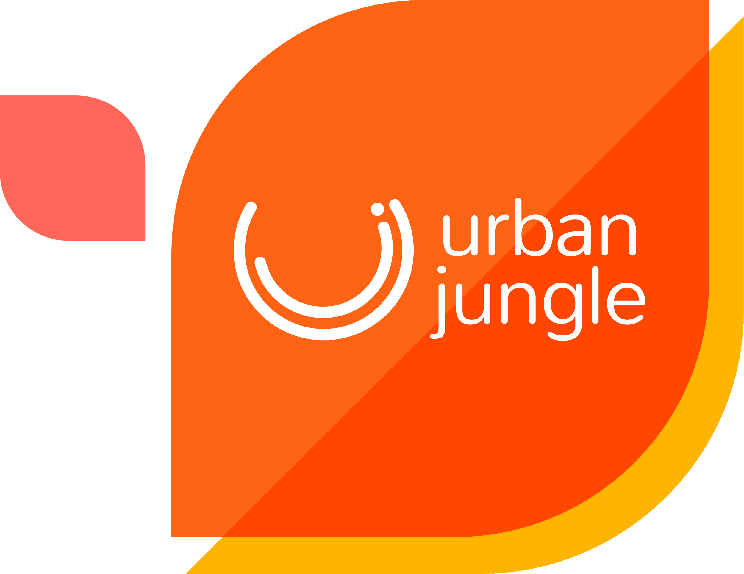
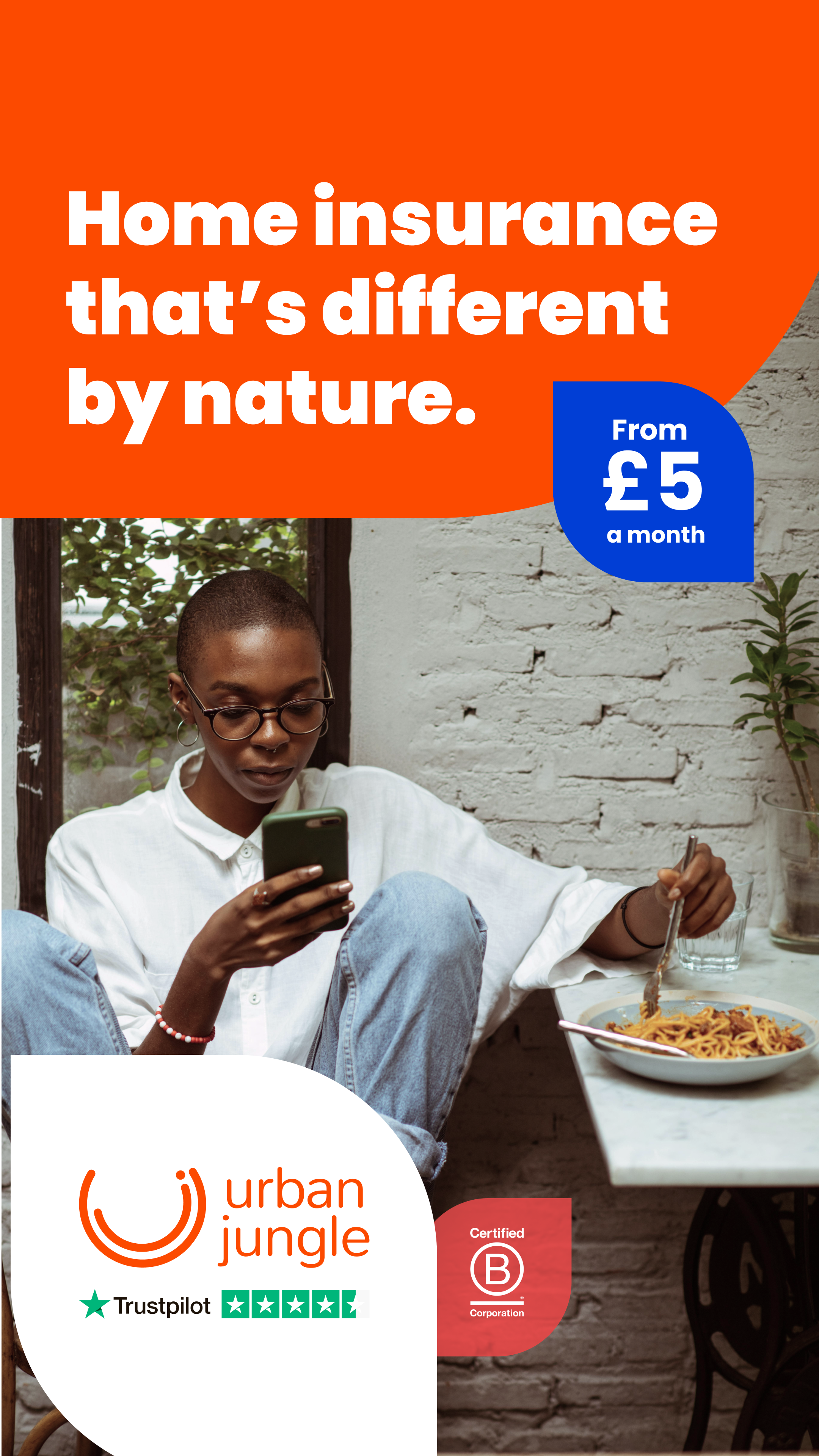
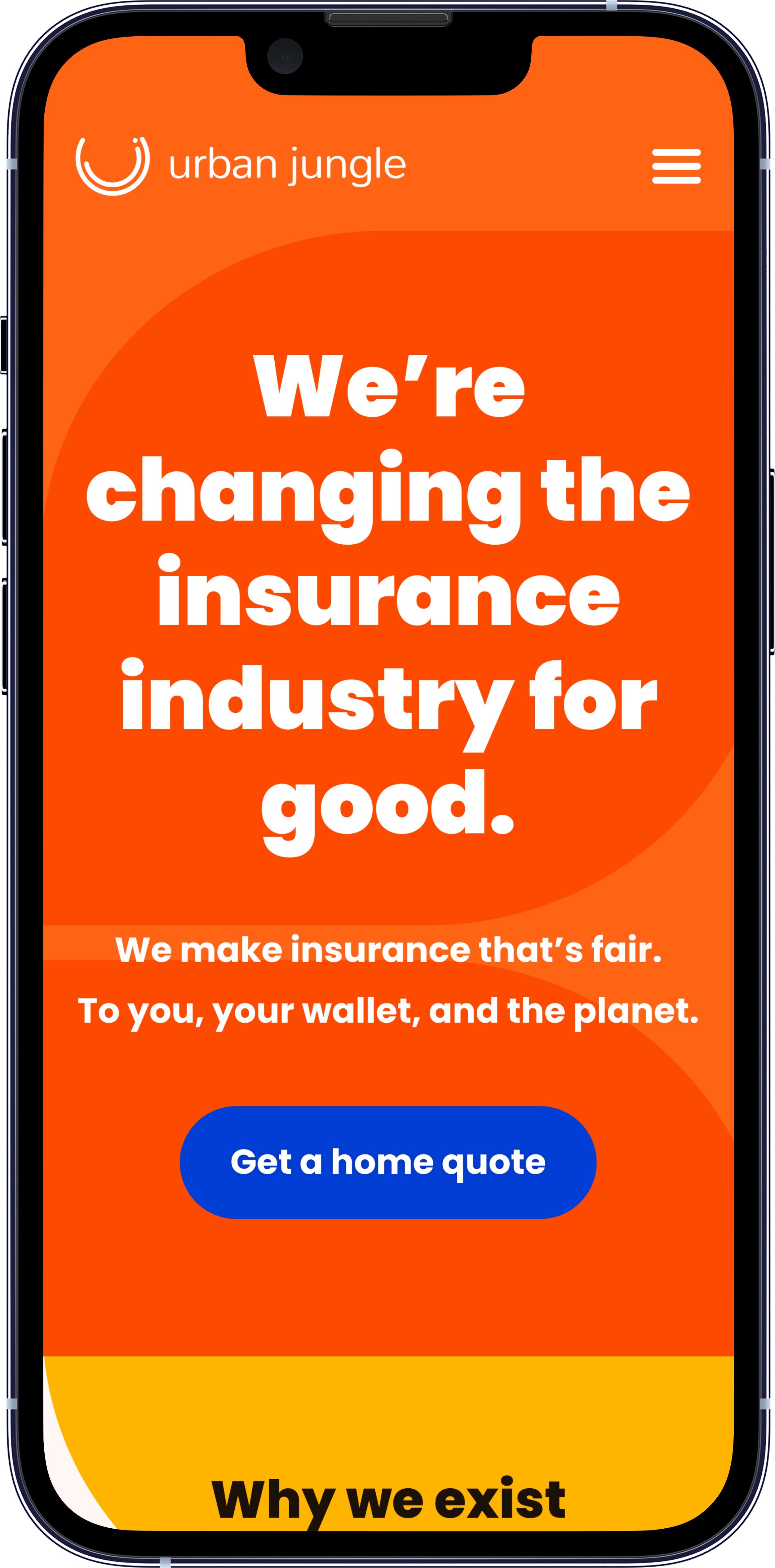
Urban Jungle had positioned itself as a differentiator in the insurance market – a B Corp insurer built on fairness, transparency, and ethical pricing in a category defined by the opposite. The brand wasn't reflecting this positioning clearly enough. The visual identity felt inconsistent, the messaging undersold the differentiation, and nothing tied together credibly across product, marketing, and lifecycle communications.
I led the full in-house brand refresh end-to-end alongside the marketing team, from strategic positioning through to execution across every customer touchpoint. We kept the core fairness messaging, the logo, and the orange – and rebuilt everything else around it.
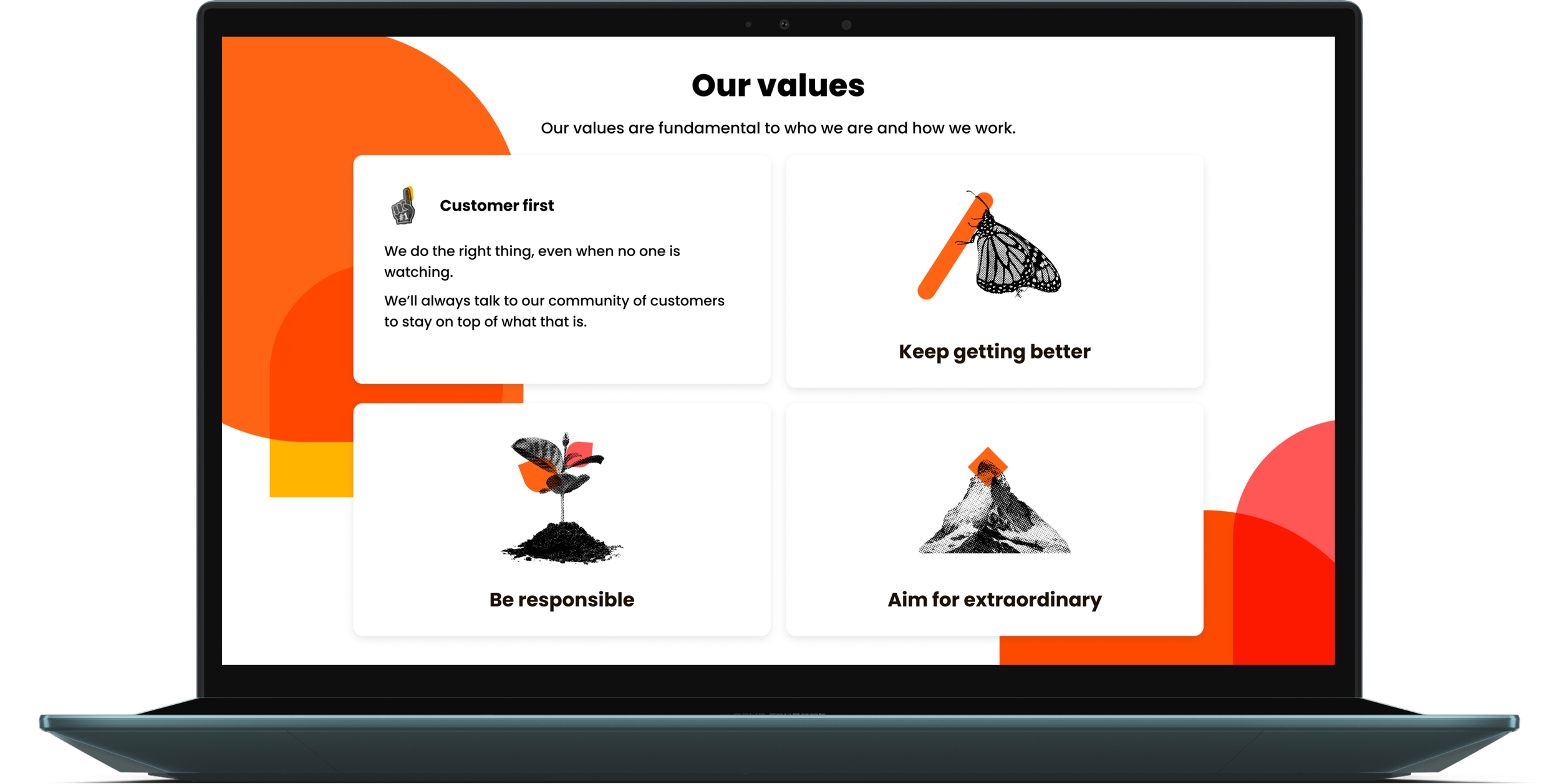
Visual identity
The work spanned more than 12 months and touched:
Product UI
200+ email templates
40+ paid ads
80+ web pages
My Role
Co-led all branding, graphic, and product design work end-to-end alongside one other designer, working within a marketing team of four including the Chief Marketing Officer, who oversaw all design and implementation decisions.
Advocated at senior stakeholder level for the decision to bring the refresh in-house, alongside the other designer
Owned design strategy, visual identity, and execution across the full brand system
Worked across brand messaging, email design, UI library, video branding for TV and social, and PPC and paid social campaign design
Updated two shared UI libraries (Grimlock and Windcharger microservices) to carry the new identity across web and product
Produced the Brand Book, updated UI Library, and refreshed UX Guidelines for long-term consistency
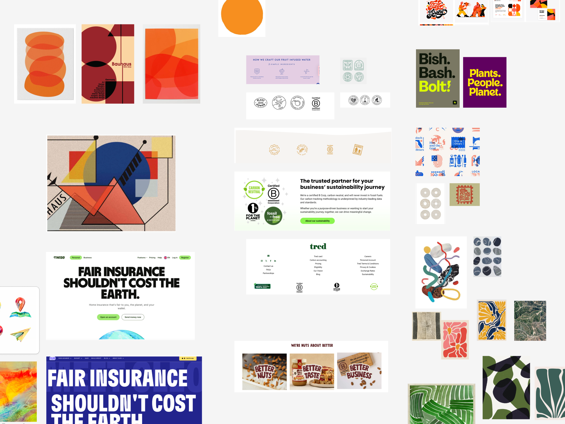
Our refreshed brand book
The Agency Challenge
The refresh began with the same external agency that led the 2021 rebrand. After multiple rounds of work, it wasn't meeting the brief. The agency couldn't convincingly render Urban Jungle's updated values into a visual identity that felt new, credible, and genuinely ours.
What wasn’t working?
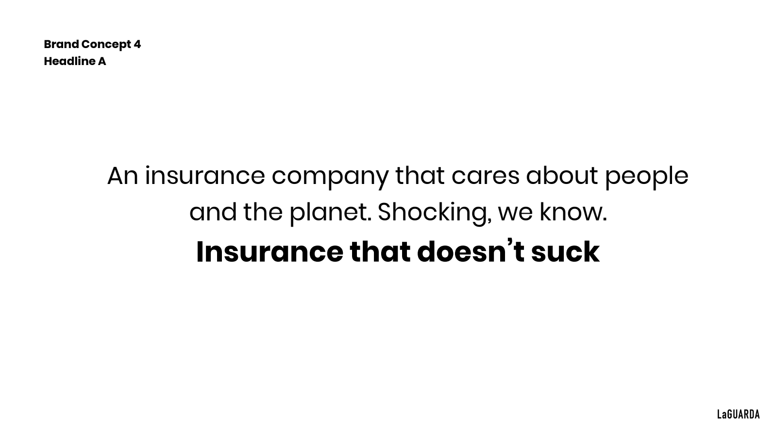
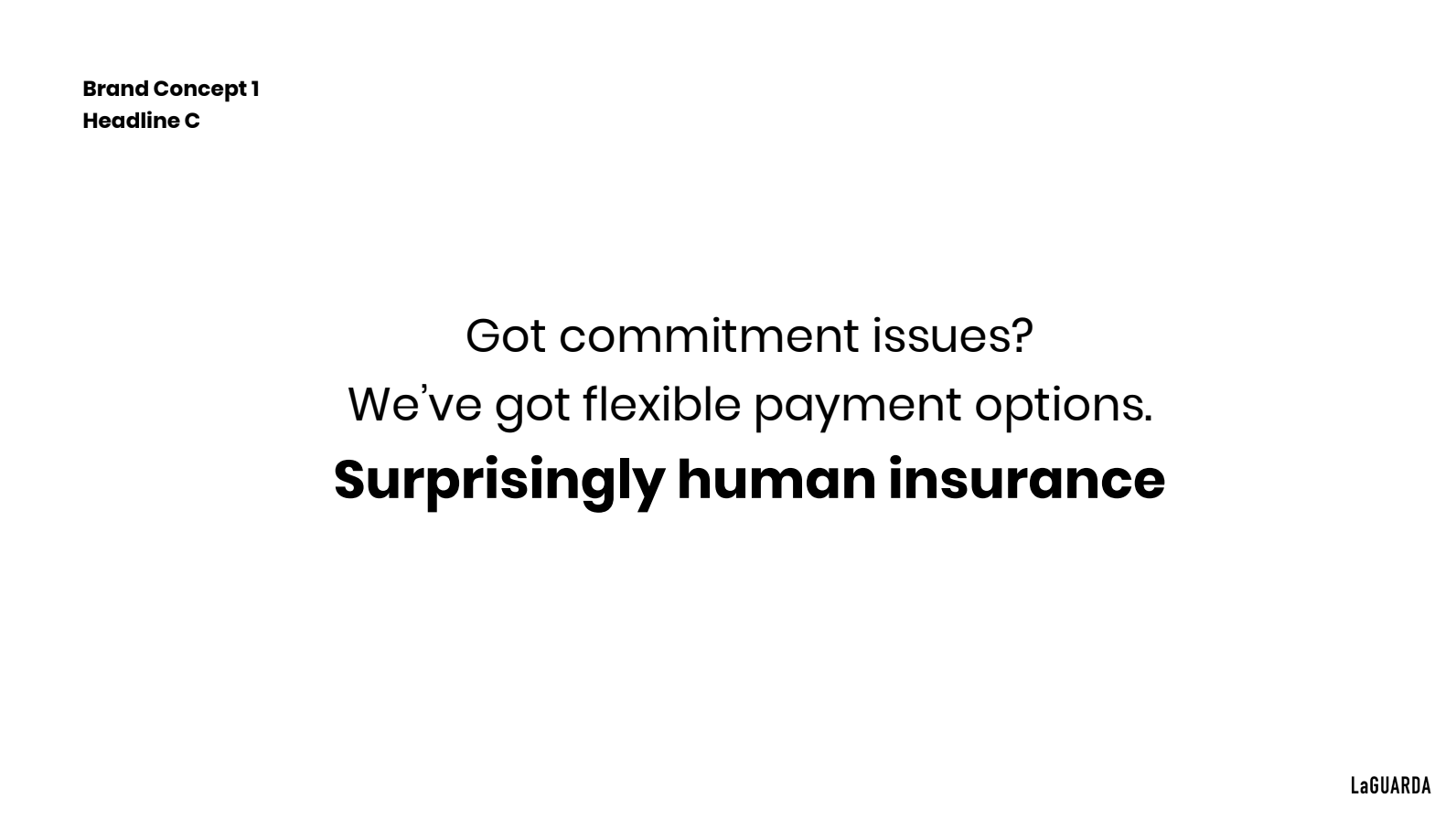
Over-reliance on stock imagery with a rough, unpolished feel which felt misaligned with a regulated financial product
Copy that skewed too heavily toward Gen Z messaging and didn't translate across our broader customer base
Repeated feedback rounds that weren't being integrated into the work
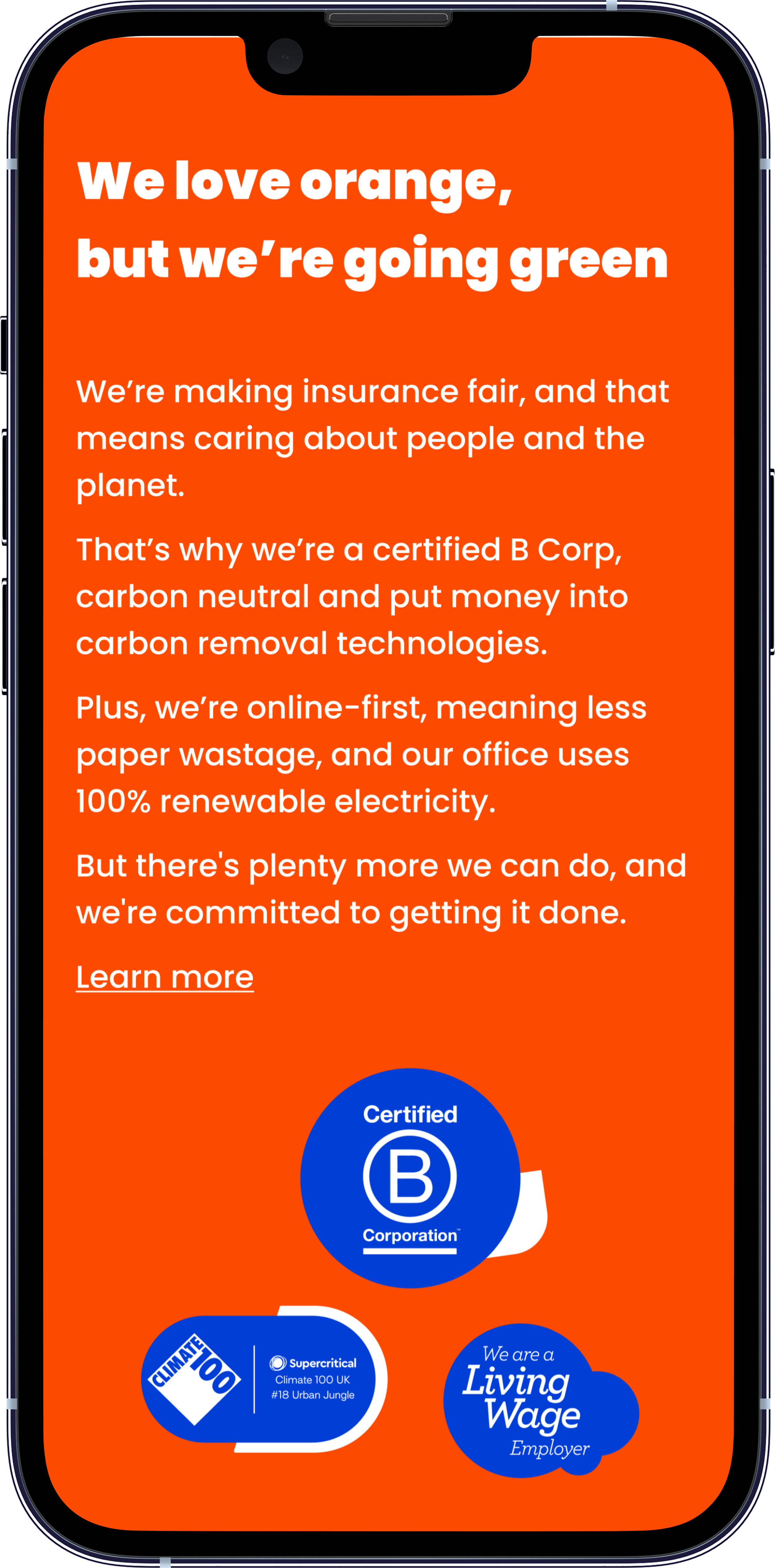
No convincing balance between the man-made and natural elements central to our people and planet brand pillars
What did I do?
Myself and the other designer made the case at the internal strategy meeting with senior stakeholders to bring the work fully in-house. We needed full creative control – and we were better placed to exercise it than an external team working at arm's length.
4.
Full brand rollout
Phase 1: Competitor research and agency audit
We started by dissecting the agency's output against brands we admired, mapping exactly what was missing. We wanted bolder visual assets, simpler messaging that worked across demographics, and flexible brand elements that could scale cleanly across journeys, emails, social, ads, and internal materials, without needing bespoke treatment or editing every time.
Design Process — Five Phases from Blank Page to Brand System
1.
Competitor research and agency audit
2.
Asset creation and refinement
3.
In situ application
5.
Engineering implementation
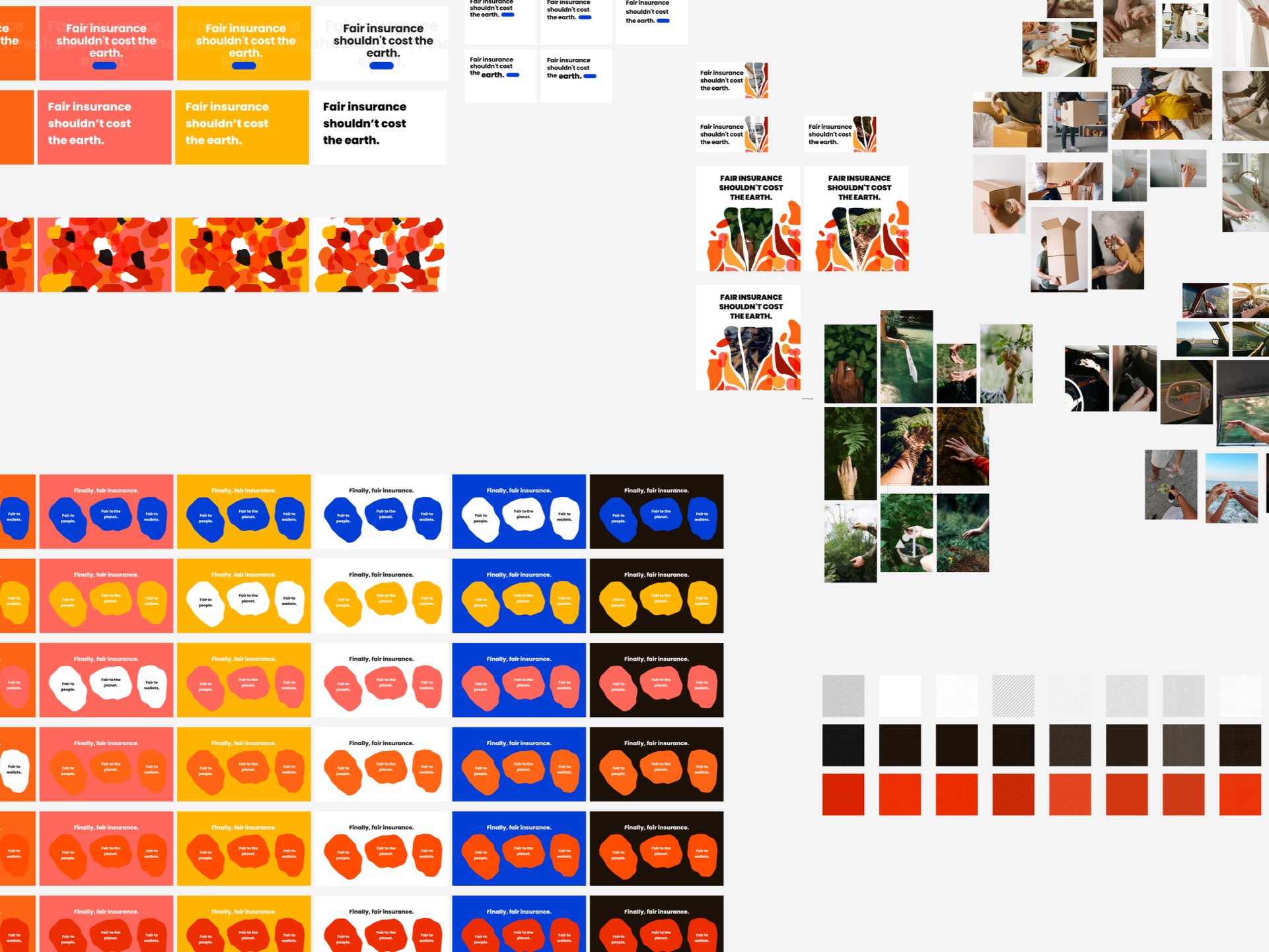
Early competitor research and brand element refinement from the agency’s work
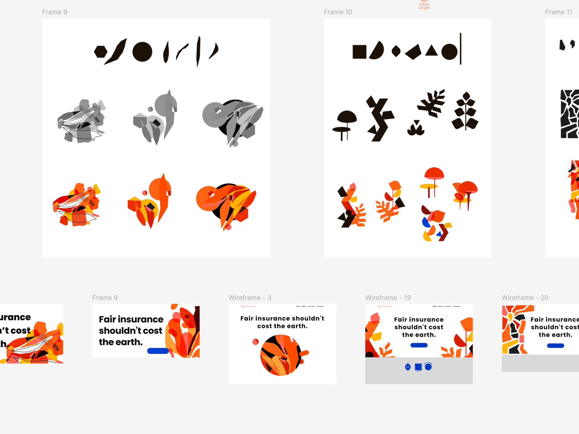
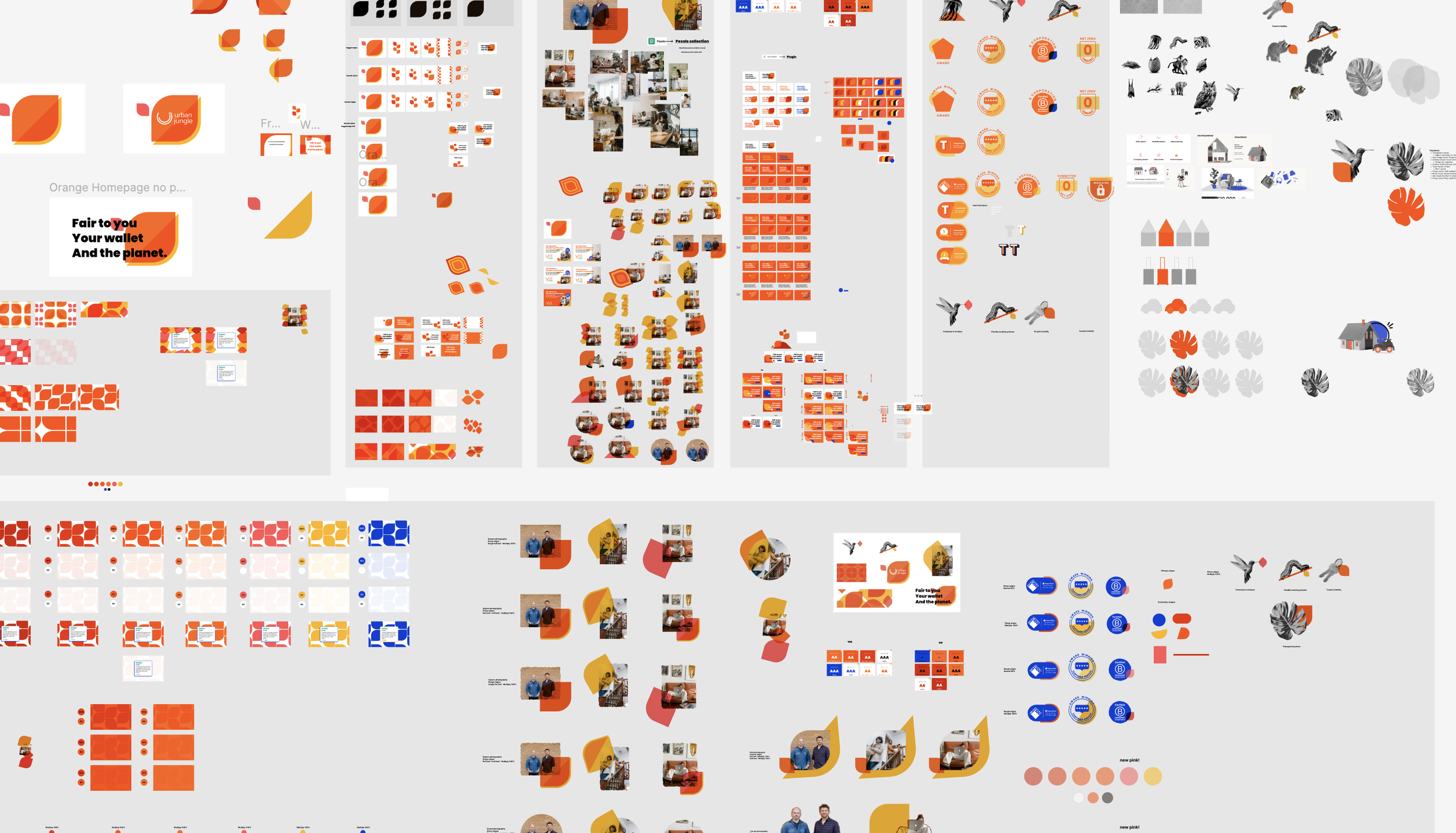
Phase 2: Asset creation and refinement
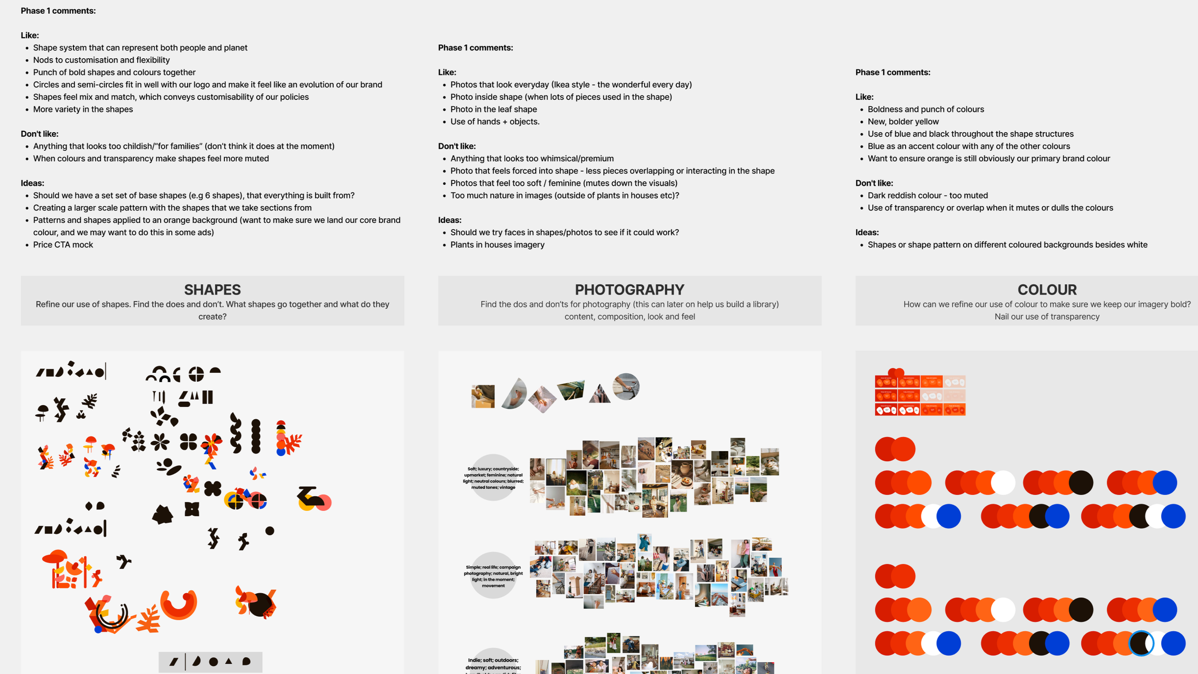
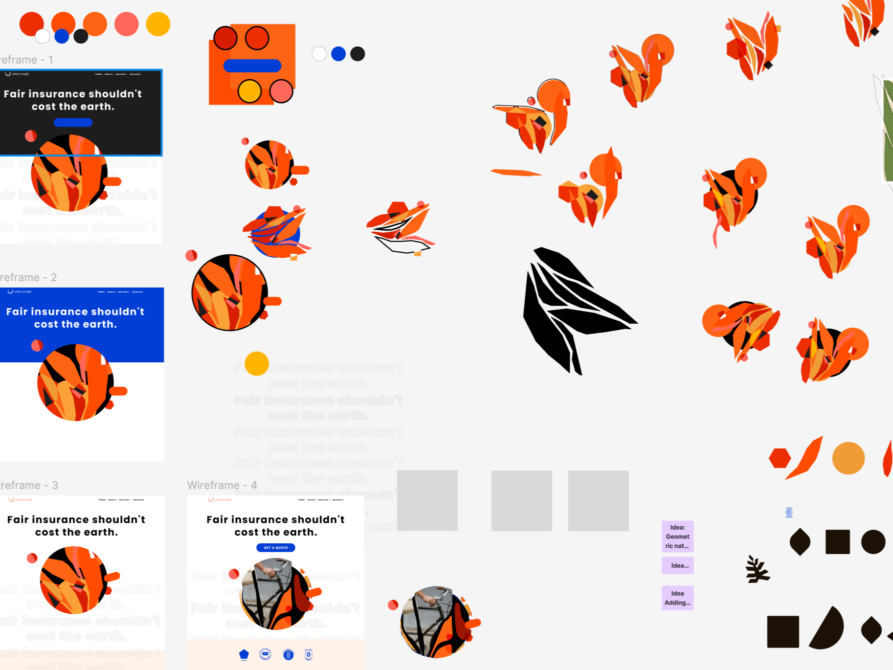
We built the foundations of the identity: colour palette, primary and secondary shapes, photography direction, and new brand elements. These went through numerous internal feedback rounds.
One early direction leaned heavily into natural, abstract shapes, combinations designed to evoke leaves, trees, and mushrooms. It didn't survive review.
The forms felt too busy, too decorative, and at odds with the simplicity that sits at the core of Urban Jungle's value proposition. An insurer operating in a notoriously complex category needs to feel immediately clear, not intricate.
Our initial refined direction was eventually scrapped. We felt that the intricacy and busyness of the shapes and photography didn’t communicate Urban Jungle’s message of transparency and simplicity.
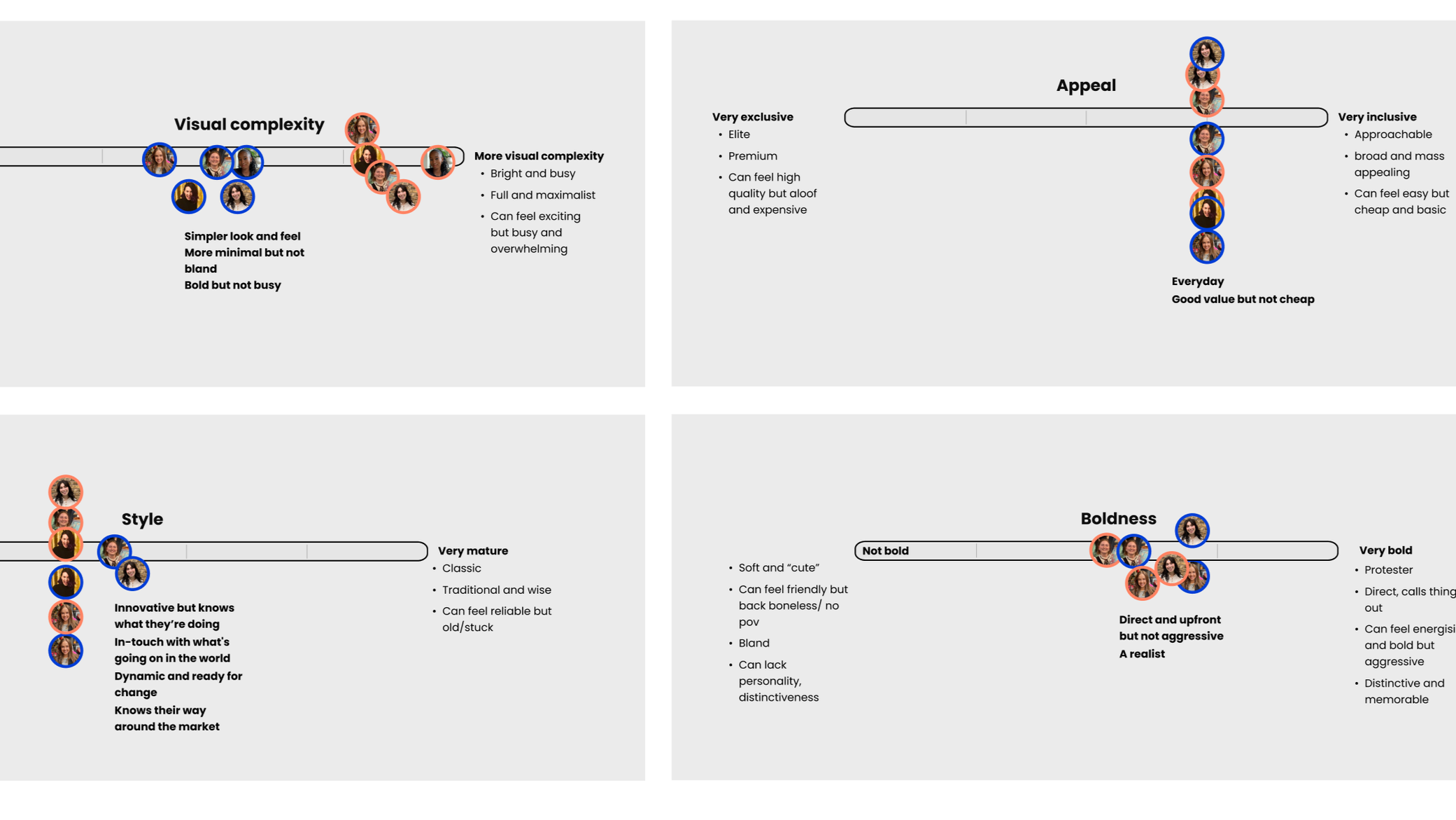
We used brand spectrums to help articulate what was missing from our initial direction. We plotted where we wanted the brand to land and where it was currently landing on the spectrum of, for example, boldness or style. The outcome? Visual complexity and style were the two themes needed to be further refined.
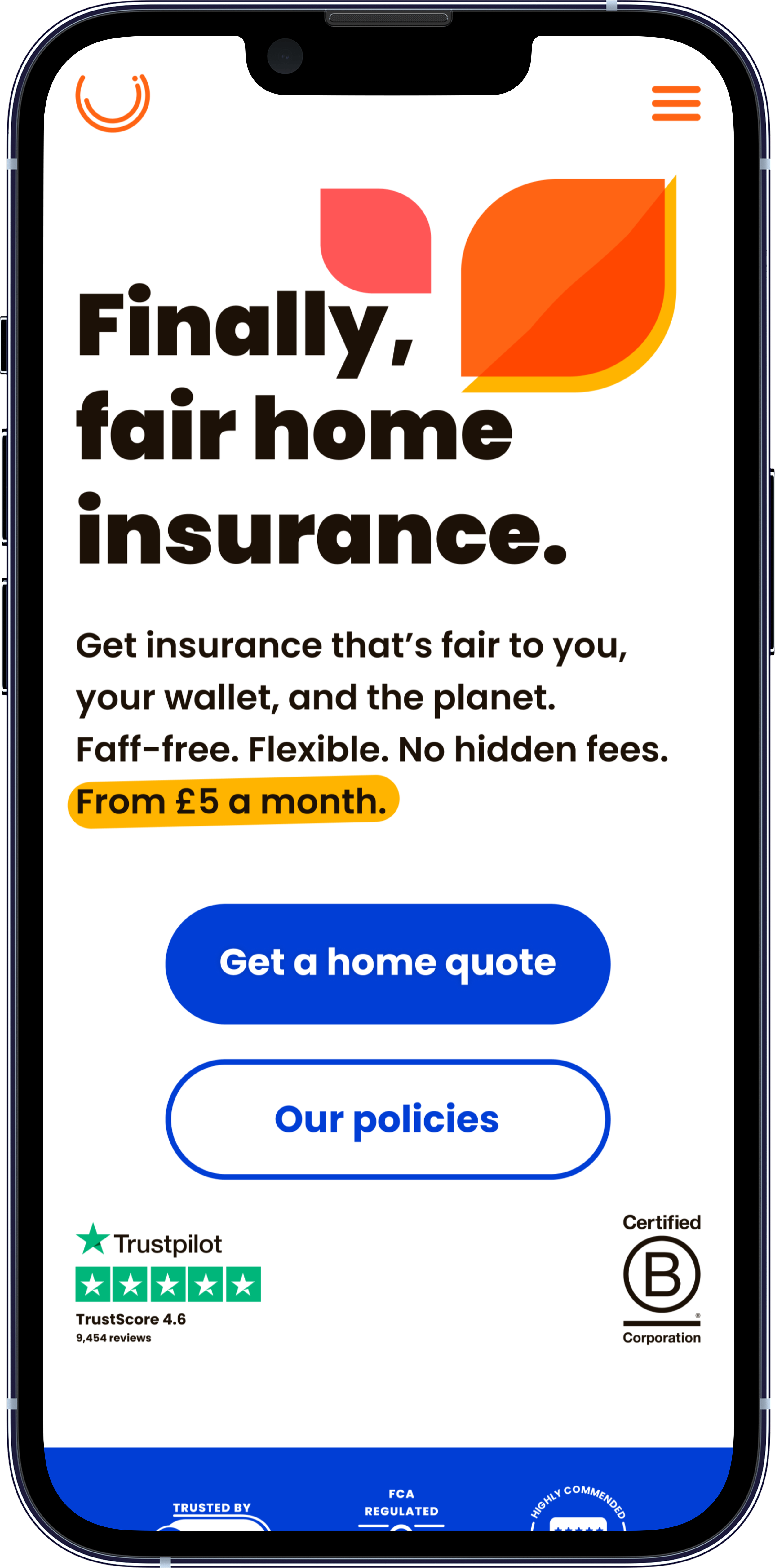
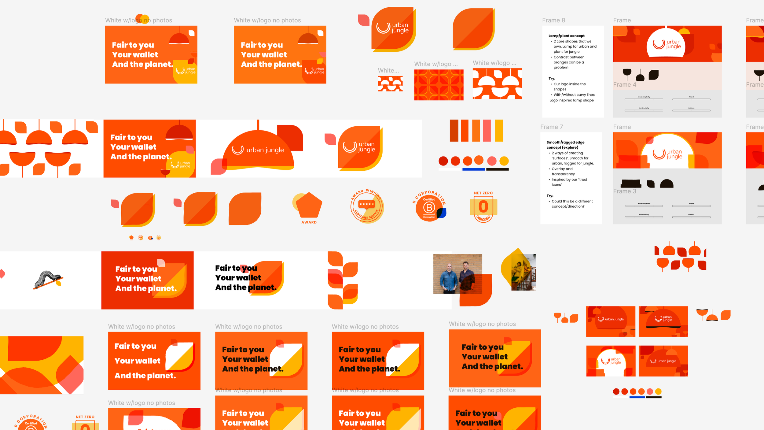
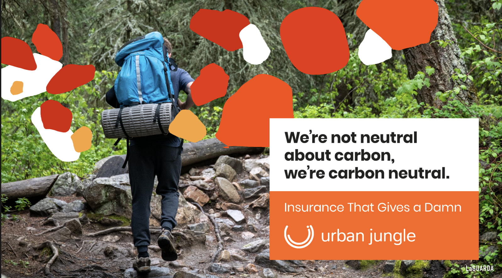
We landed on a petal as the hero brand element. Natural in origin, but with sharp edges that read as digital and man-made. It held both sides of the brand story in a single form.
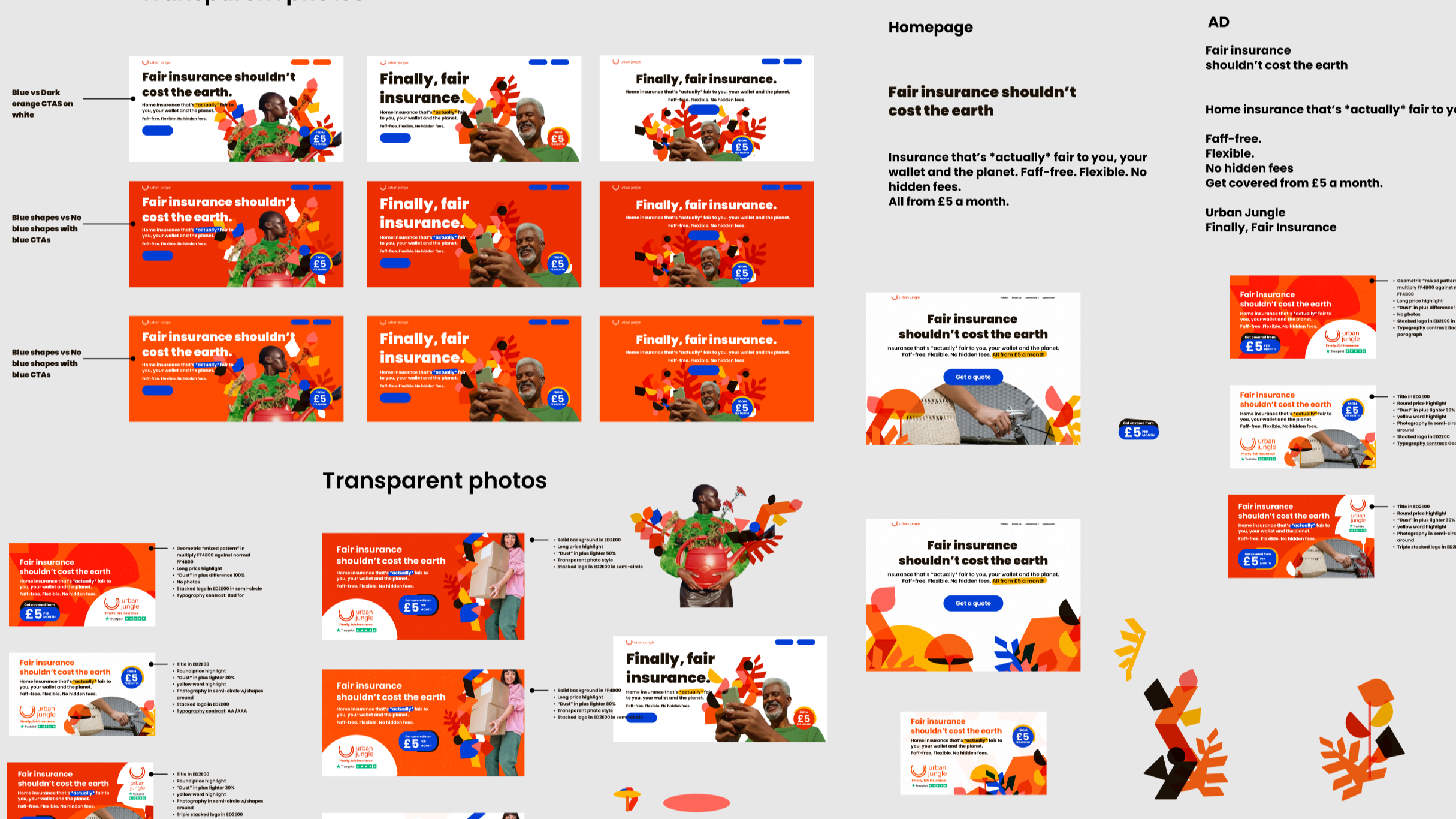
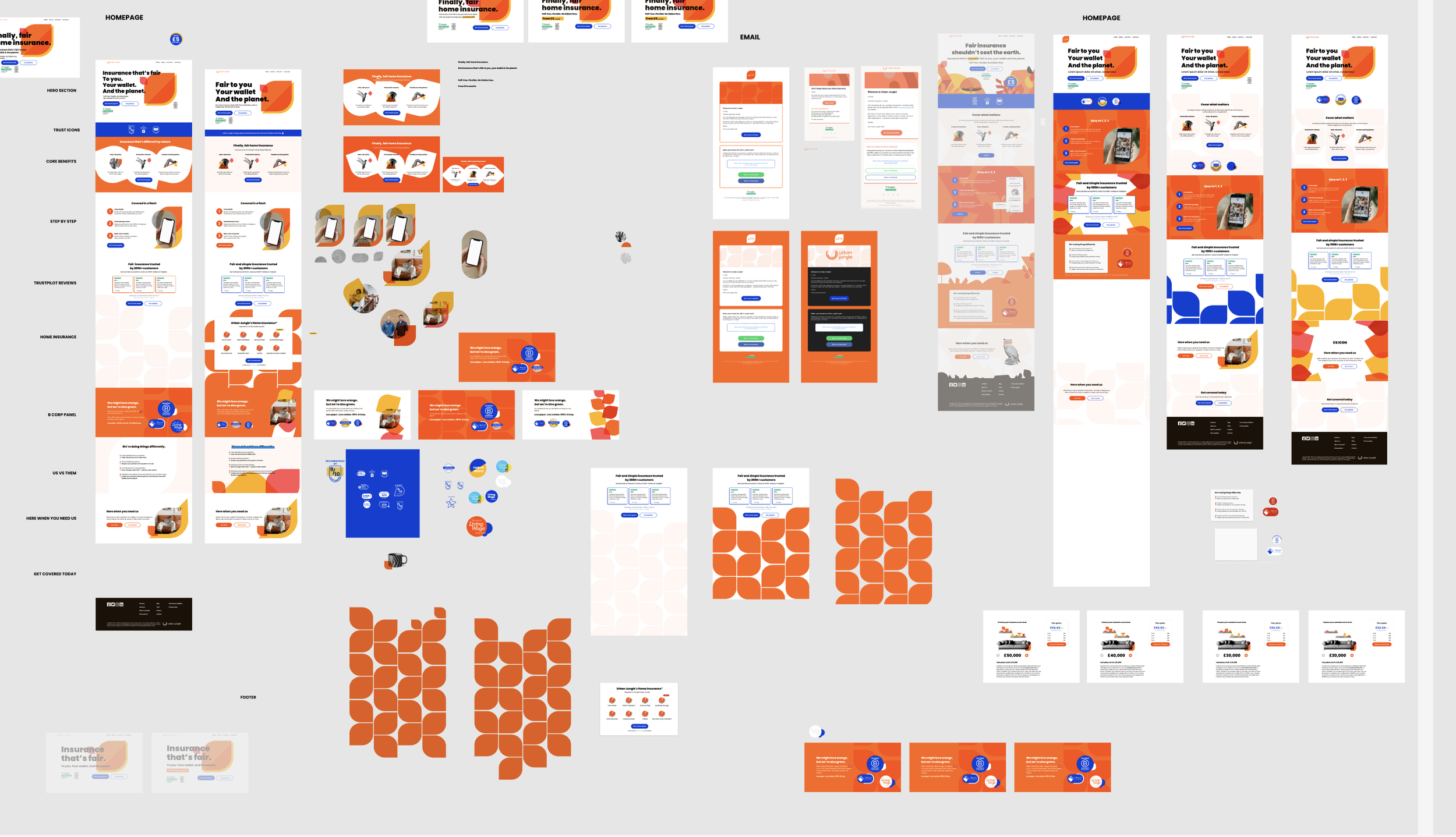
Phase 3: In situ application
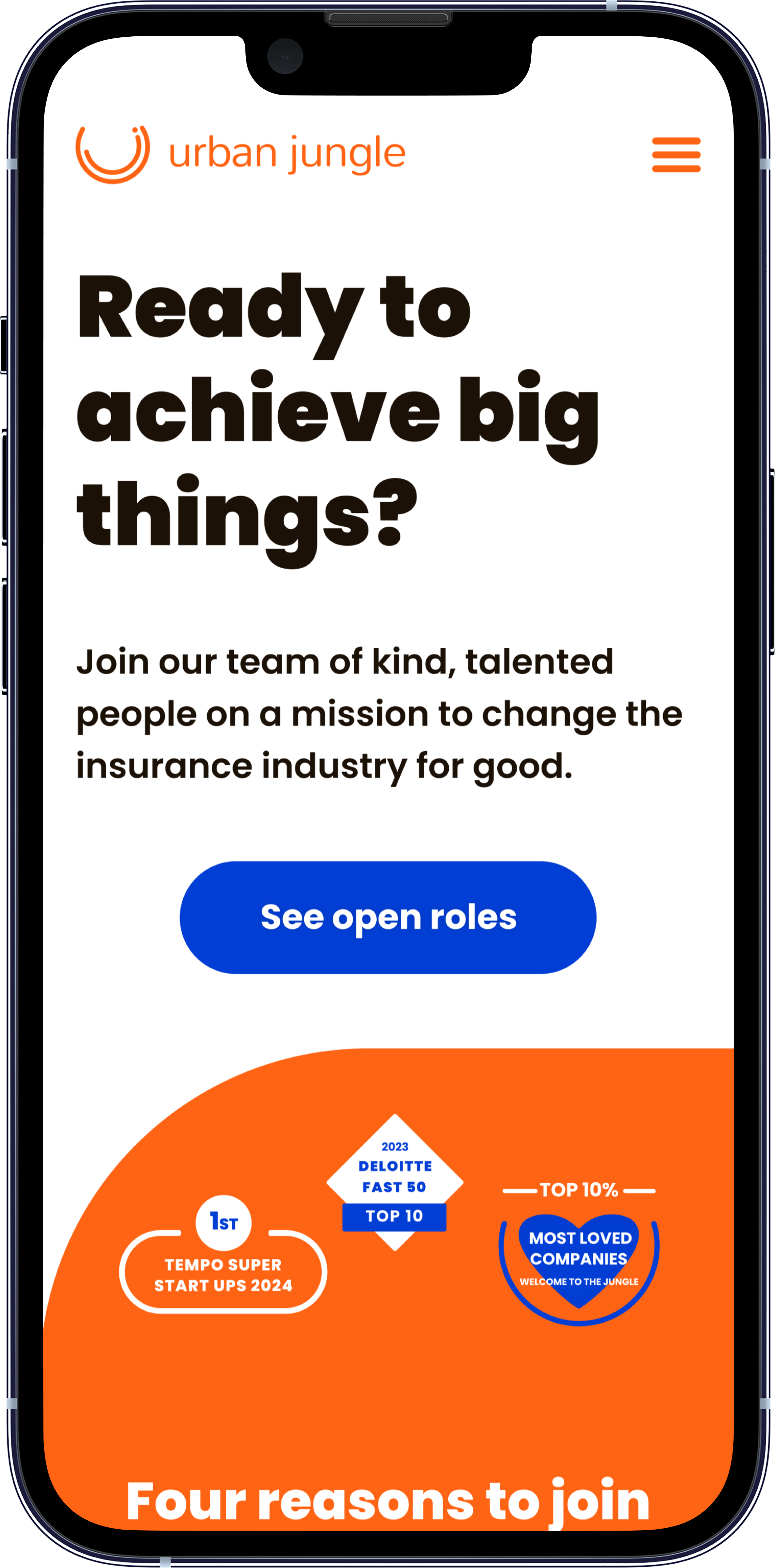
Before rolling out across the full brand, we redesigned three key pages (Homepage, Careers, and About Us) to pressure-test the identity in context. We also ensured the new branding worked across existing customer journeys and touchpoints such as the account management space. These designs went through full internal review with the team, CEO, and compliance team before anything moved forward.
Phase 4: Full brand rollout
Implementation of the brand across: UI library, marketing materials, email templates, slide decks, PPC and paid social assets, internal company documentation and resources, video branding for TV and social, and physical branding for our office space.

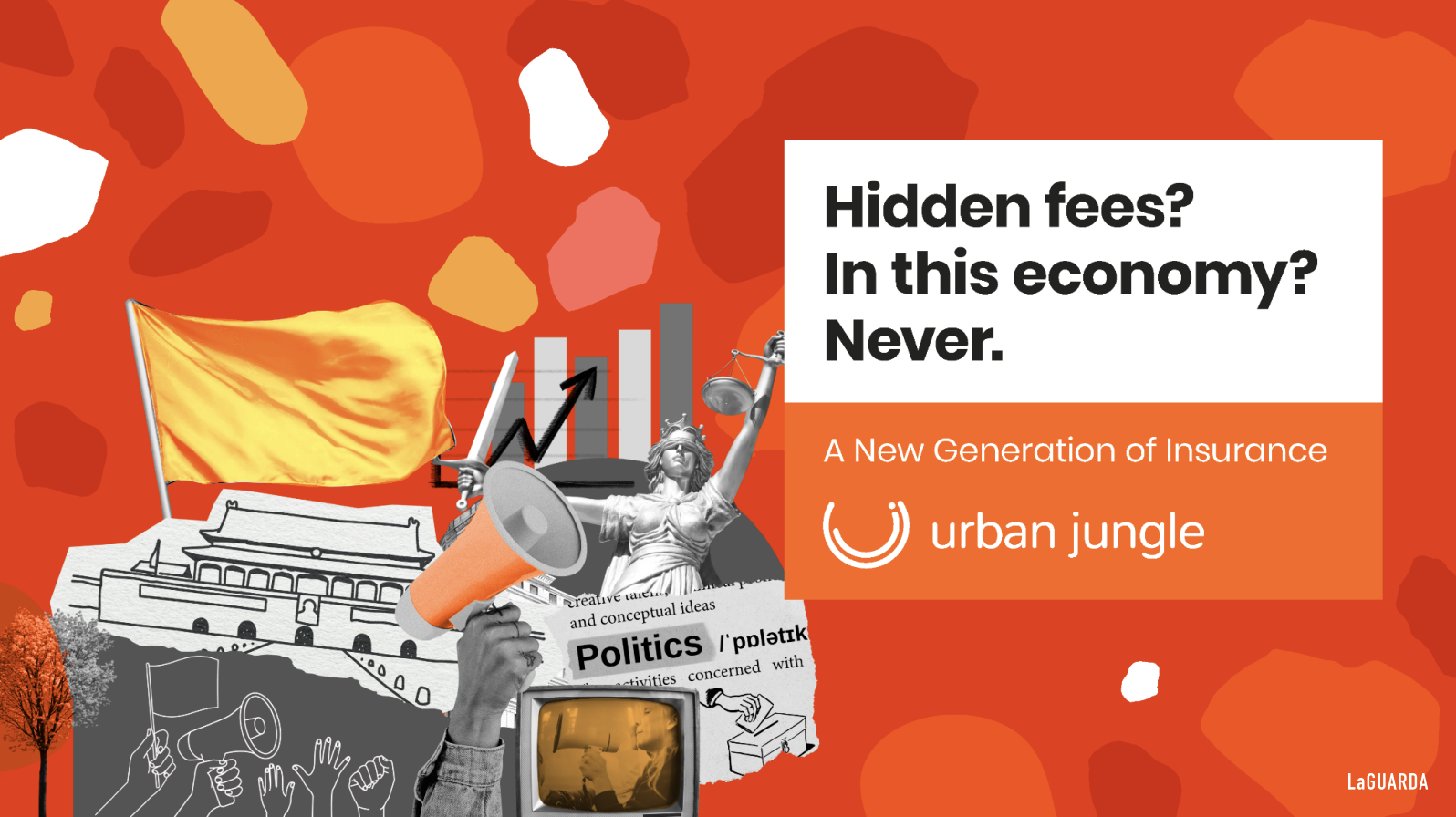
Some of the agency’s concepts that skewed too Gen Z in their messaging or didn’t provide the simplicity and flexibility we were looking for in terms of branding.

New paid social ads
Phase 5: Engineering build
New component libraries built to re-skin the existing website and purchase journeys, plus net-new standalone pages built from scratch.
Before anything went live, I led a end-to-end testing across the site, reviewing every page and touchpoint against the new brand standards.
This covered:
Visual consistency across colours, typography, iconography, and spacing
Component behaviour across breakpoints, with a focus on mobile given 57% of our customers purchase on mobile
Copy alignment with the refreshed tone of voice across UI, microcopy, and error states
Accessibility checks across contrast ratios and interactive states
The audit surfaced 70+ snags which were resolved before go-live, alongside meaningful accessibility improvements across contrast ratios, focus states, and interactive elements throughout the site.
Execution at Scale
Product and Web
Updated Grimlock and Windcharger shared UI microservices with new colours, iconography, and new icon and minicon sets
Full redesigns of the Homepage, About Us, and Careers pages
Targeted visual updates across product flows: success states, customisation pages, cancellation journeys, password reset, and account management
New homepage modules built to strengthen trust and differentiation: mobile carousels, social proof sections, B Corp accreditation, and pricing highlights
Communications
120+ transactional email templates rebuilt across onboarding, servicing, and lifecycle touchpoints
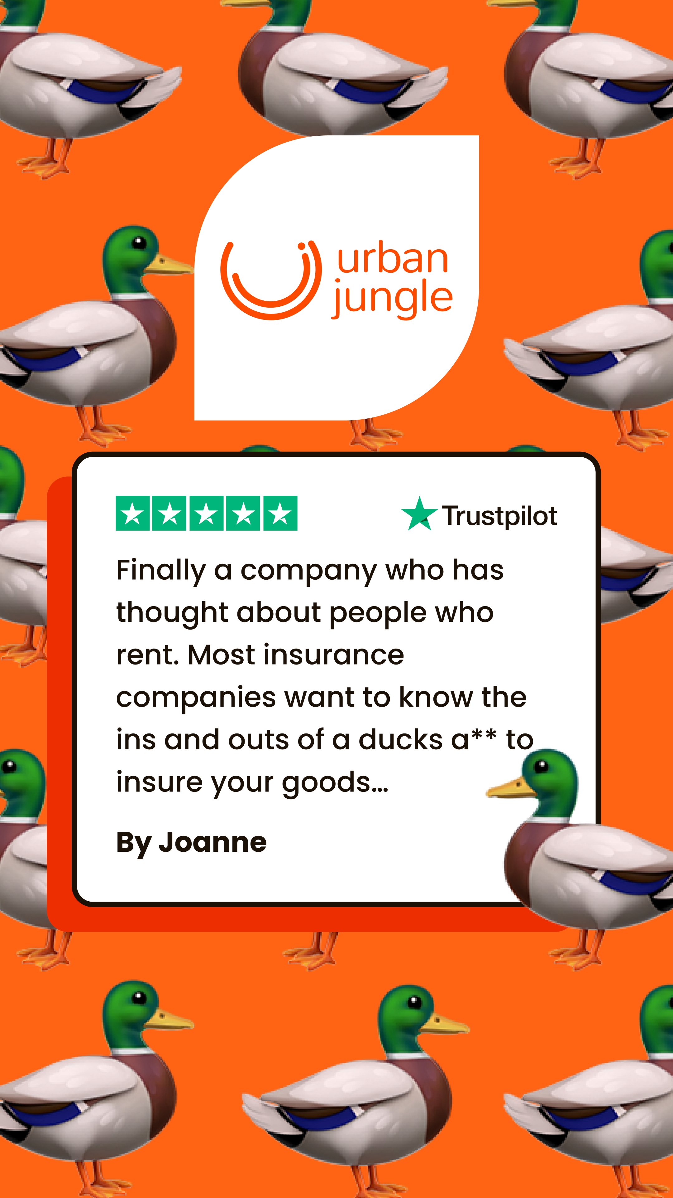
80+ marketing emails redesigned across newsletters, promotional, and retention campaigns
40+ paid ads redesigned across PPC and paid social channels
TV ad updated to reflect the refreshed visual identity and brand direction
System Documentation
Brand Book, updated UI Library, and UX Guidelines established as the shared reference for the whole business
Internal asset suite created including slide deck templates, messaging frameworks, and freelance onboarding templates to ensure brand consistency beyond the core design team
+4.3% retention
for contents insurance customers following email improvements
Key Stats
+3% brand awareness
measured via survey over nine months post-launch
+0.2pts Trustpilot score
with increased review volume
100K+ followers
scaled across all social media platforms
+8% email open rates
in the three months post-refresh
10M+ views
on socials across all platforms utilising new brand
The refreshed brand also extended to white-label partners including Amazon Insurance Store, and received consistent positive feedback from customers, freelancers, and job candidates – suggesting the identity landed externally as well as internally.
Reflection
This project pushed me well beyond traditional product design.
I worked on brand messaging, video branding for our TV ad and social channels, email design, and PPC and paid social campaign creative, learning new tools including Premiere Pro and After Effects alongside the design work. It was a genuine stretch, and one I sought out rather than inherited.
Design advocacy was a key lesson I took away from the project.
Working with an external agency and making the case, at senior stakeholder level, that their work wasn't good enough required a clarity of design opinion I hadn't had to exercise quite so directly before. Knowing what's wrong with something, being able to articulate it specifically, and then being willing to own the consequence of that judgement (in this case, the entire in-house workload that followed) is a vital design skill. This project made me better at it.
The scale of ownership was significant too. Every internal resource, customer-facing journey, and product was touched. Getting that right, with full visibility from senior leadership throughout, sharpened how I approach sign-off, documentation, and system thinking – not just for the immediate launch, but with the view of consistency and scalability in the long-term.