

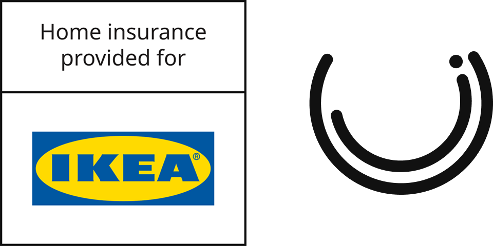
Urban Jungle × IKEA UK
Give IKEA's 10 million UK loyalty members a home insurance product as trusted as the brand they already love
Overview
Most home insurance products feel transactional and anonymous. IKEA customers, already loyal to a brand built on value, accessibility, and trust, had no way to protect their homes through it.
I led the Product Design workstream for a new IKEA-branded home insurance product, pairing Urban Jungle's underwriting expertise with IKEA's enormous UK reach.
The goal was to deliver a fully white-label, conversion-optimised experience across direct and PCW channels – proving that sub-brand partnerships could unlock meaningful new volume without compromising on brand integrity or user experience.
My role
One of two designers on the project, with direct line management of the other designer and full ownership of cross-functional collaboration across engineering, product, and commercial teams. I also led the external design relationship with IKEA UK's design and compliance teams throughout the sign-off process. Copy was owned collaboratively with Marketing.
Defined and delivered the end-to-end design across five purchase journeys and account management
Led stakeholder alignment internally across product, engineering, and compliance, and externally with IKEA UK
Used Figma Make and Claude Code to produce rapid prototypes for IKEA's compliance and design sign-off process
Managed iterative design work throughout the build in response to third-party requirements and engineering constraints
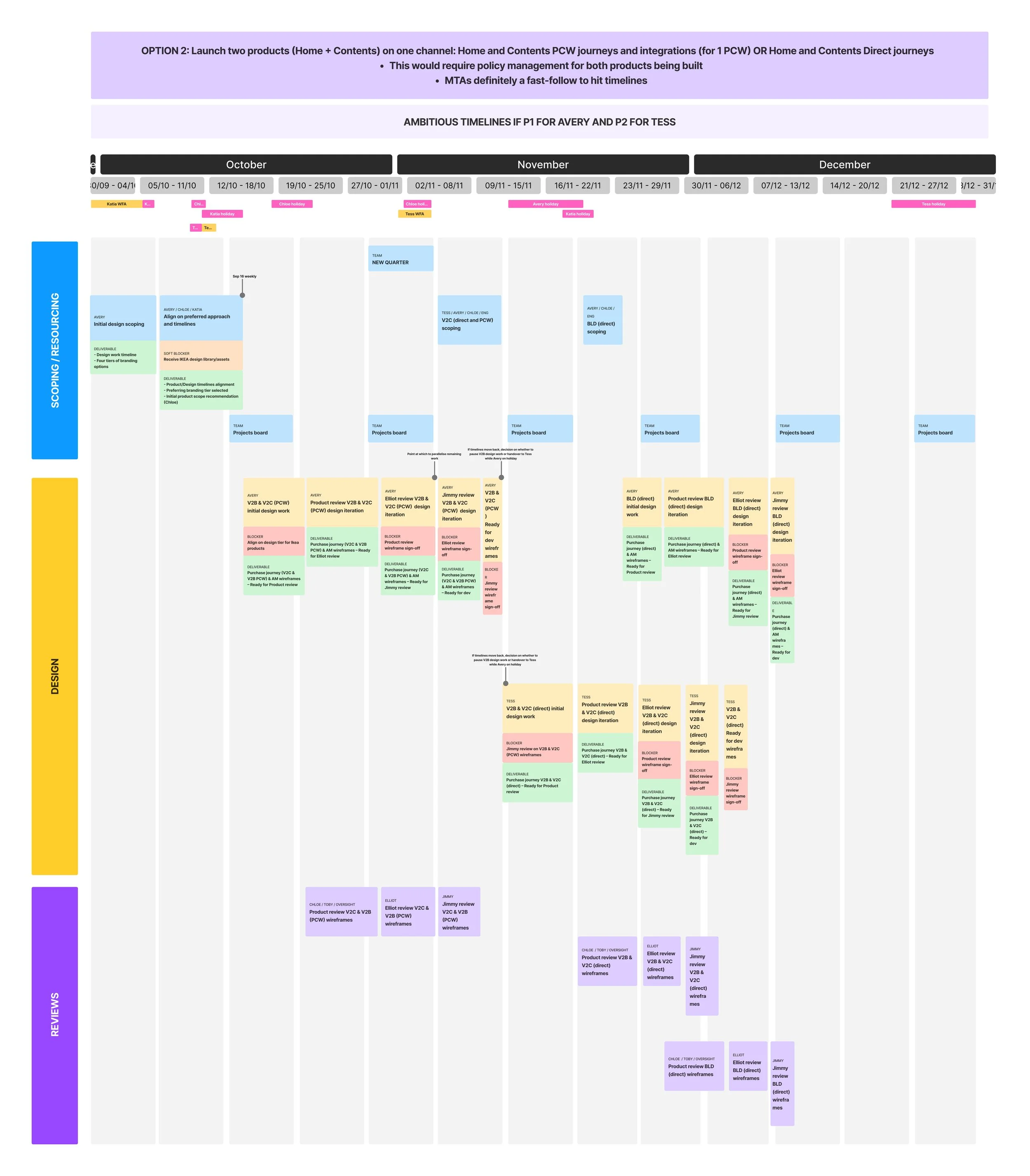
Example of timeline and resource planning for IKEA design and build
Why This, Why Now
Price comparison websites now account for over 50% of home insurance research in the UK, with Urban Jungle selling closer to 65% of its own policies via PCW rather than direct. The majority of that traffic flows through just four platforms (Compare the Market, GoCompare, MoneySuperMarket, and Confused) which together represent 95.6% of PCW home insurance users.
Within that environment, brand is more decisive than it might appear. While price drives the initial search, it rarely determines the final choice:
53% of consumers prefer to buy from a well-known insurance brand on a PCW, even when a cheaper alternative is available (UK Home Insurance Consumer Research Report, 2022)
IKEA's UK brand recognition – backed by over 10 million IKEA Family loyalty members – represented a rare opportunity to compete on trust rather than price alone.
A white-label product under IKEA's name gave Urban Jungle a credible route to volume on PCWs without needing to out-spend established insurance brands on marketing.
10M+
IKEA Family members in the UK
Key Stats
95.6%
of PCW home insurance users use the four platforms we're integrating with
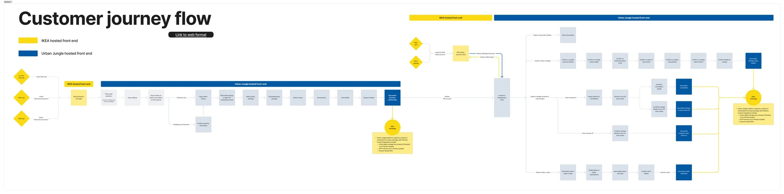
Customer journey flow for direct purchase journey
53%
of consumers choose a trusted brand over a cheaper unknown on PCW
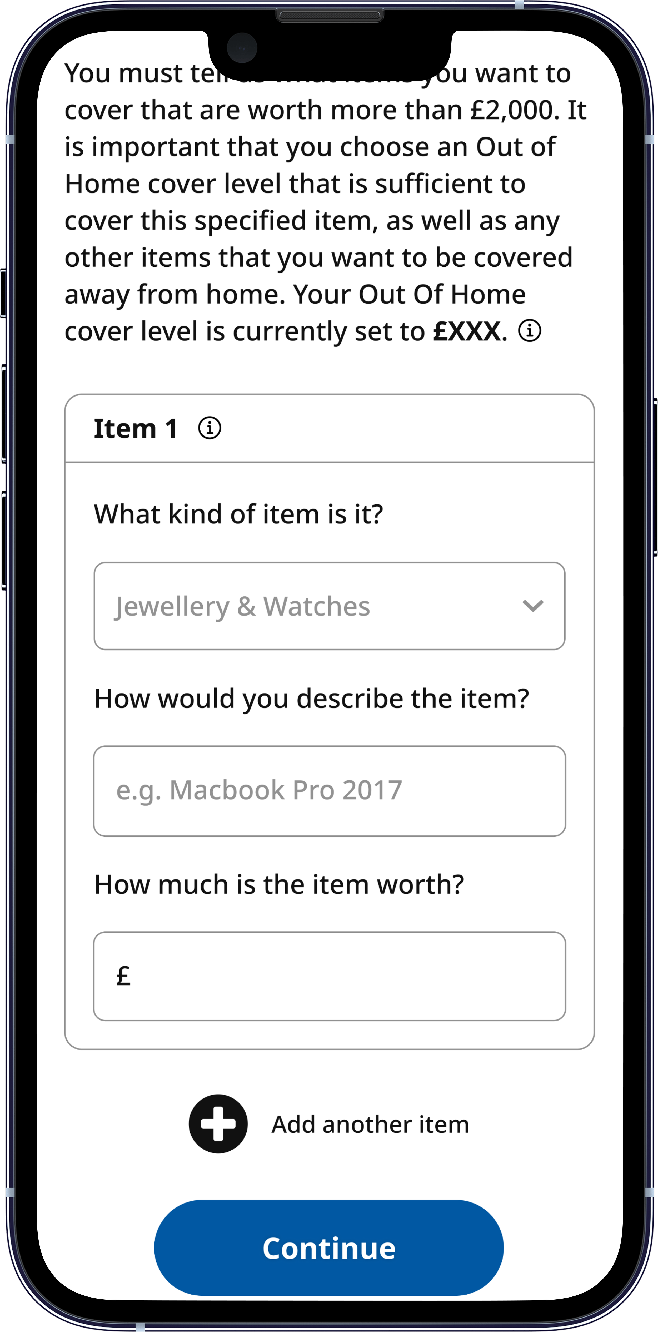
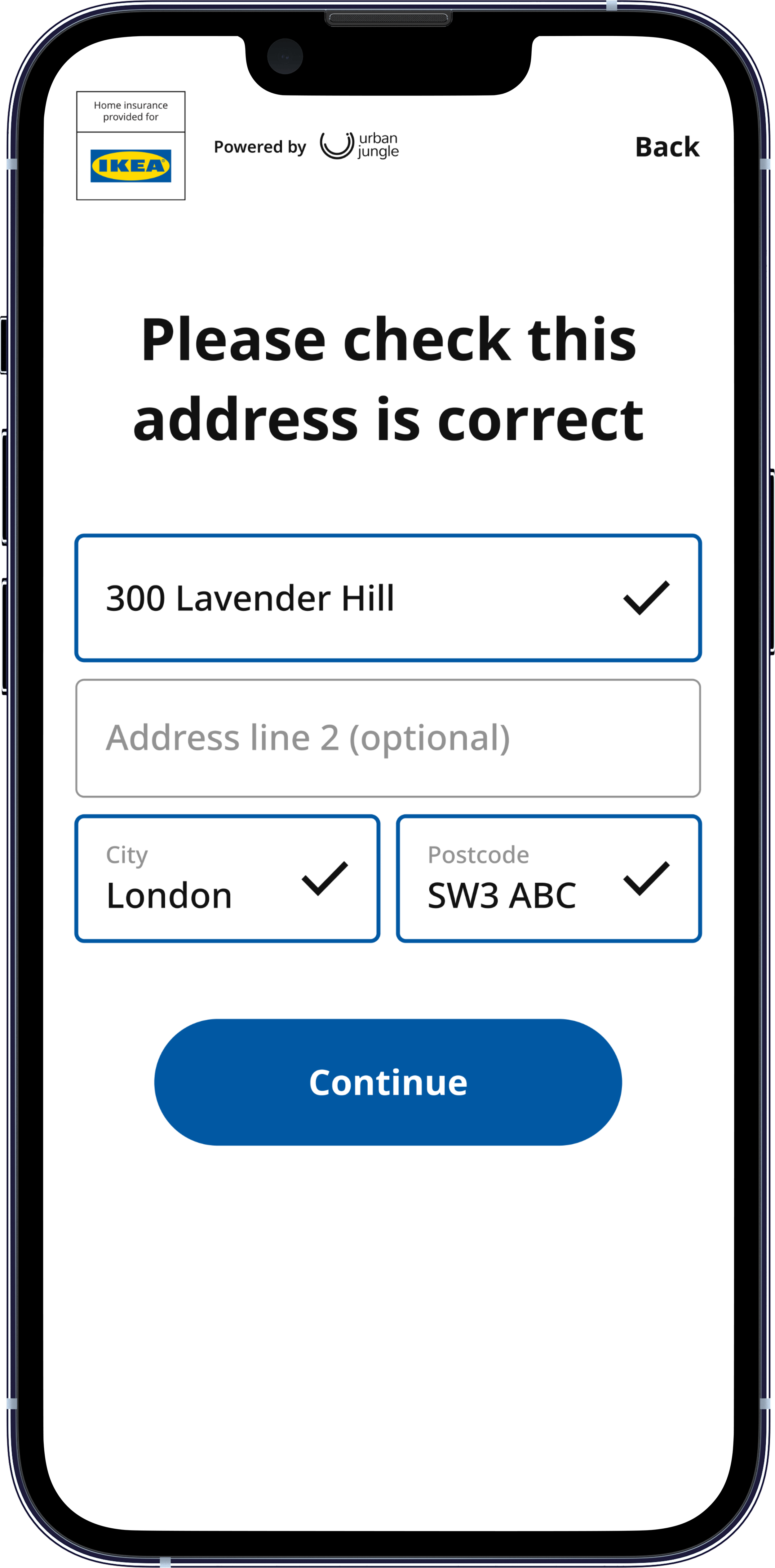
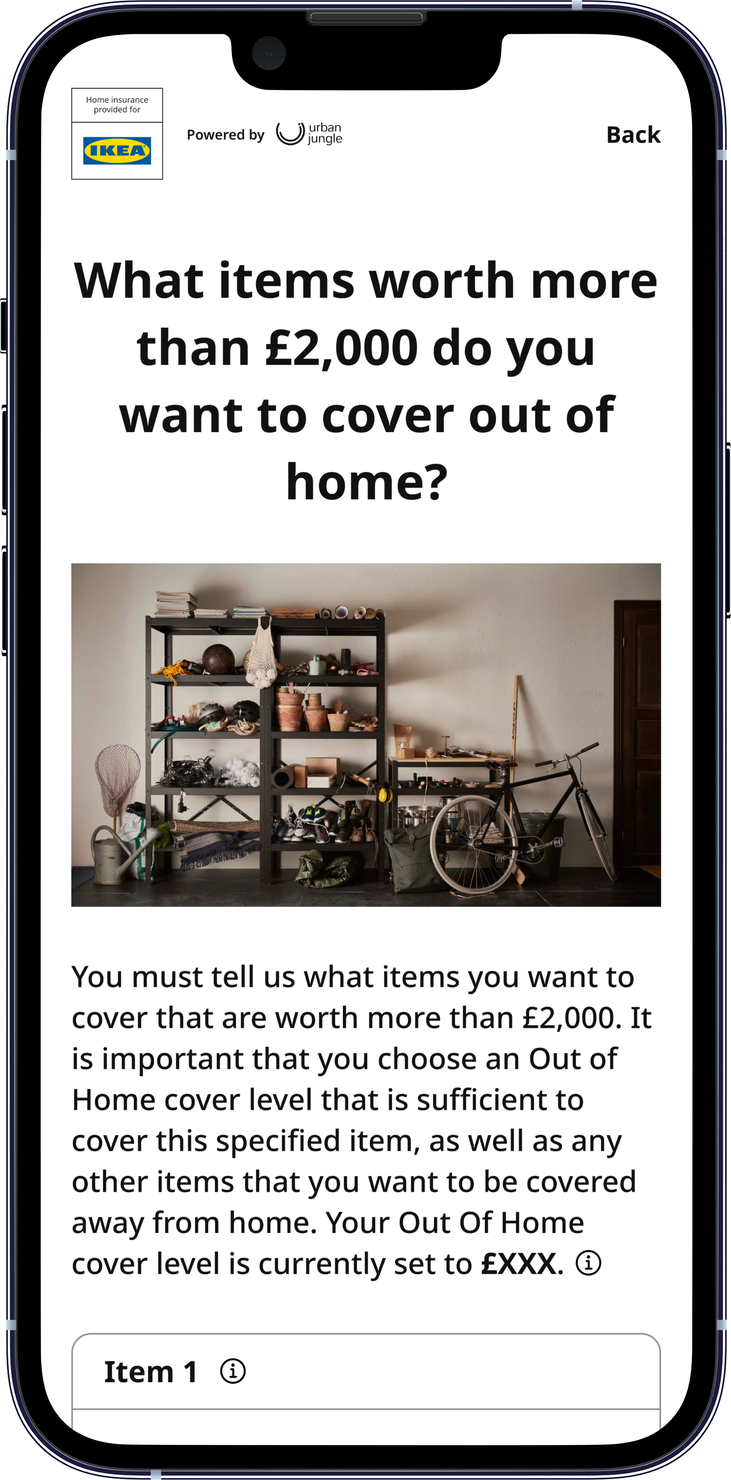
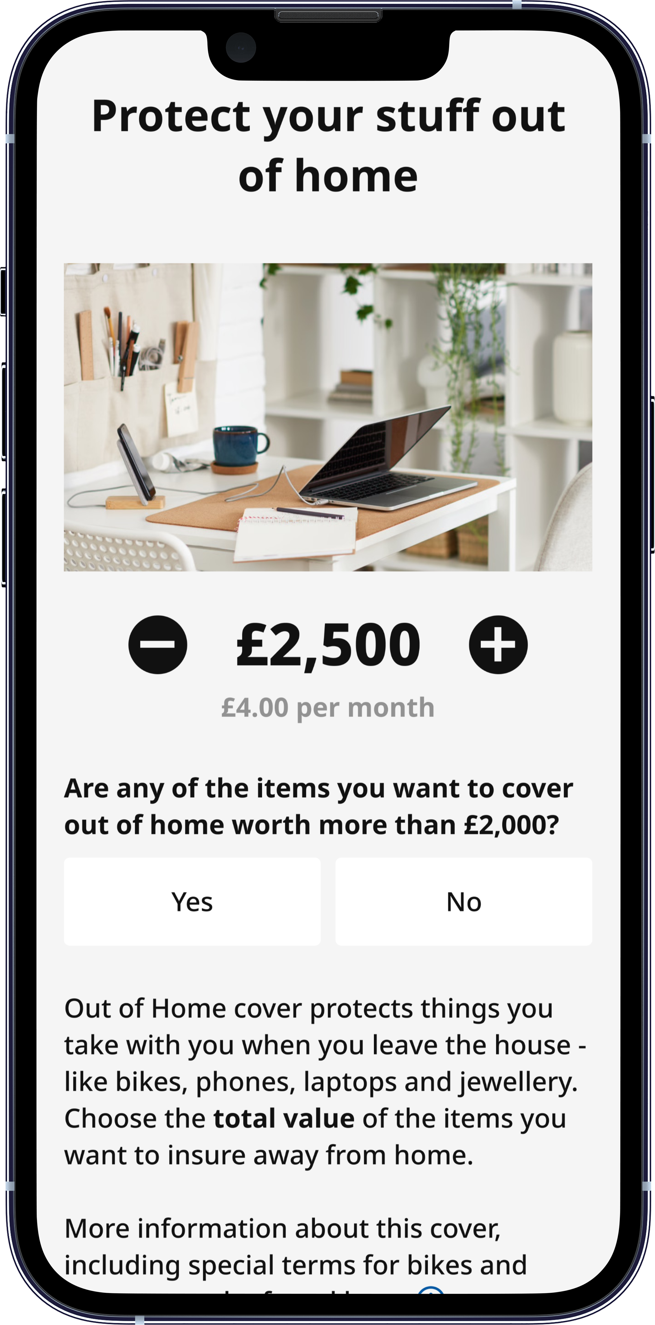
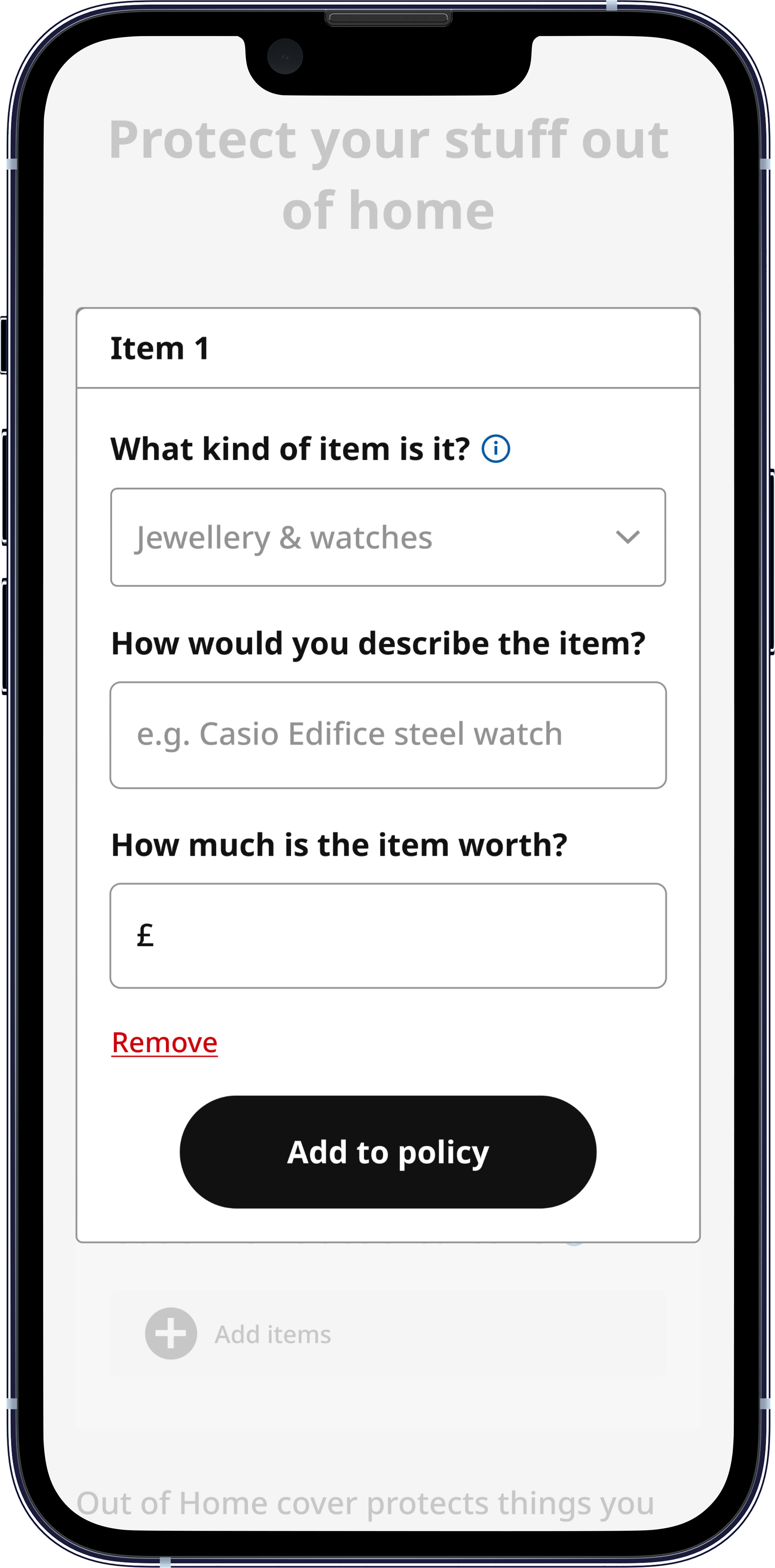
High friction initial design – Out of Home declaration on separate page
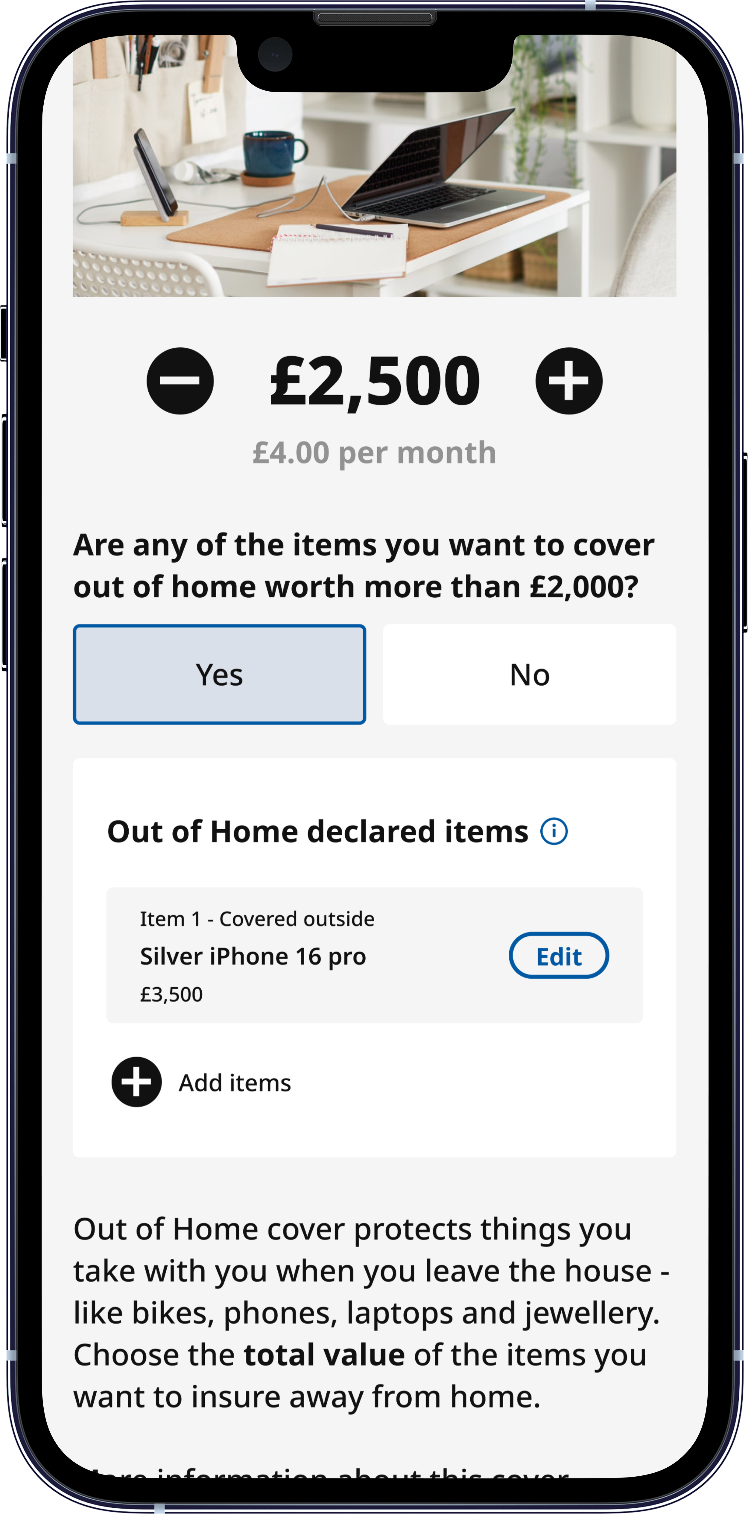
Updated design – Integrated Out of Home component and modal to reduce user cognitive load
Design Deep Dive
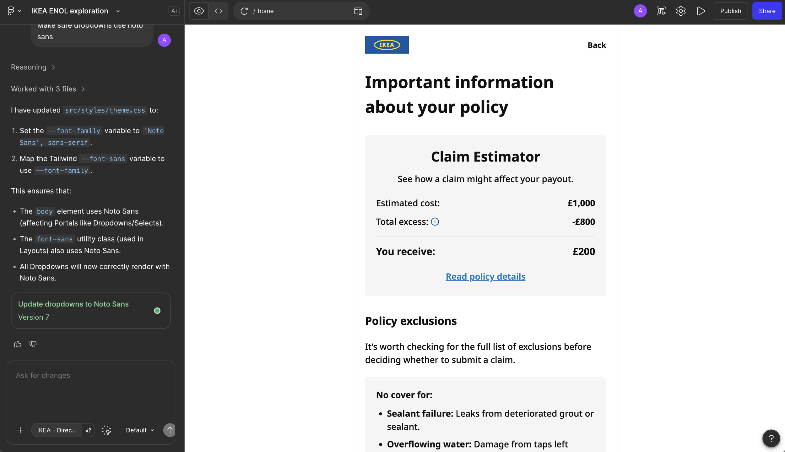
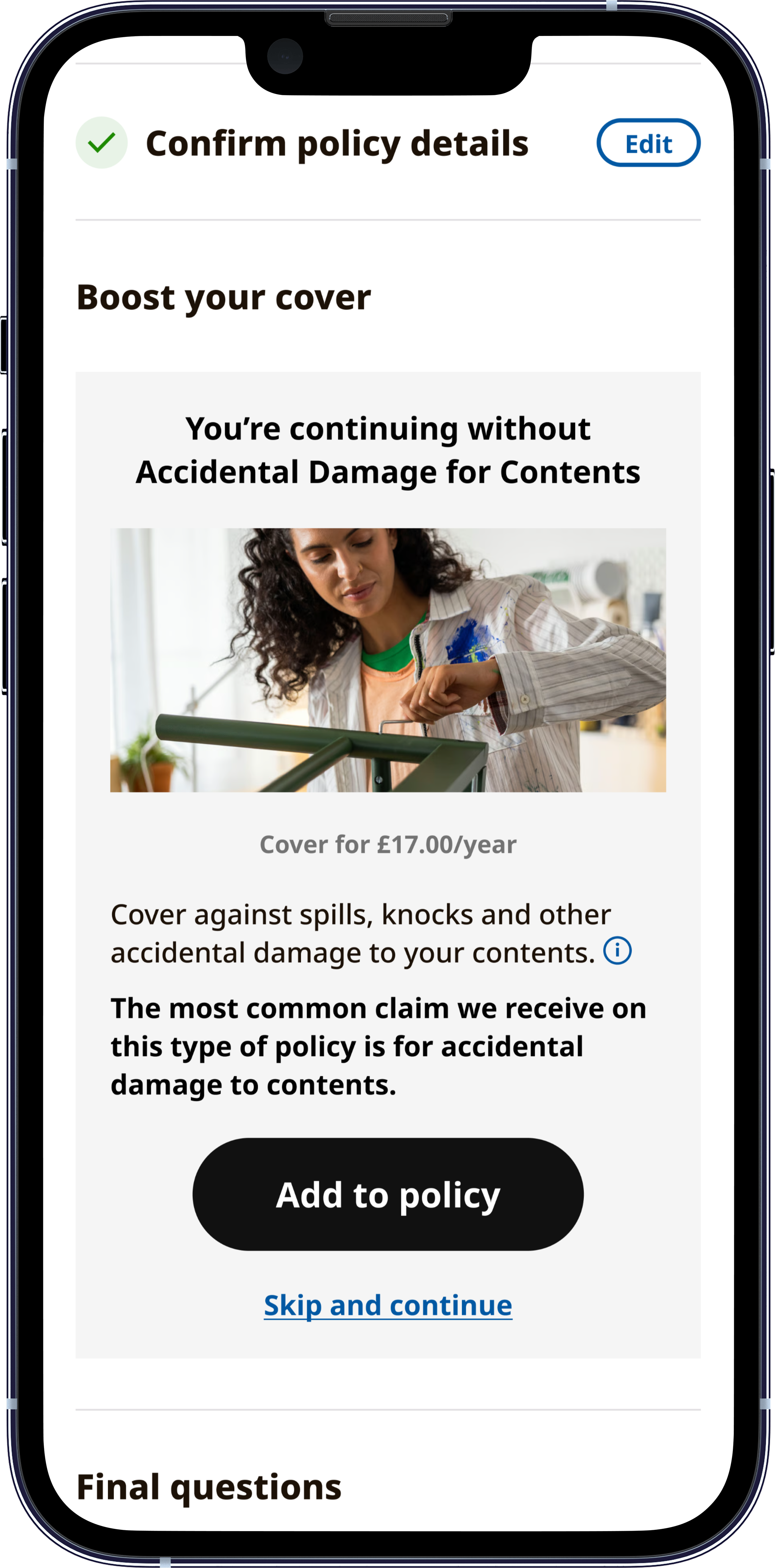
Feature 1: Redesigned Out of Home Cover — Reducing Cognitive Load at a Critical Drop-off Point
The original out of home cover flow required customers to navigate to a separate, standalone page to declare individual items valued over £2,000. Sitting outside the main purchase journey, it created an abrupt context switch at exactly the point where customers are closest to completing. Hotjar recordings and conversion funnel data confirmed this was a meaningful source of friction with >4% of customers dropping out of journey on this page.
The redesign brought the entire declaration experience into the Customise Cover page, the natural home for coverage decisions, through an integrated component and modal that surfaces immediately after a customer selects Out of Home cover.
By asking for item declarations in context, rather than routing users away to a separate screen, we removed a navigation step, reduced cognitive load, and created a more logical, connected interaction rhythm.
This was one of several places where IKEA's design constraints pushed us to tighten UX decisions we'd previously deprioritised on our own product.
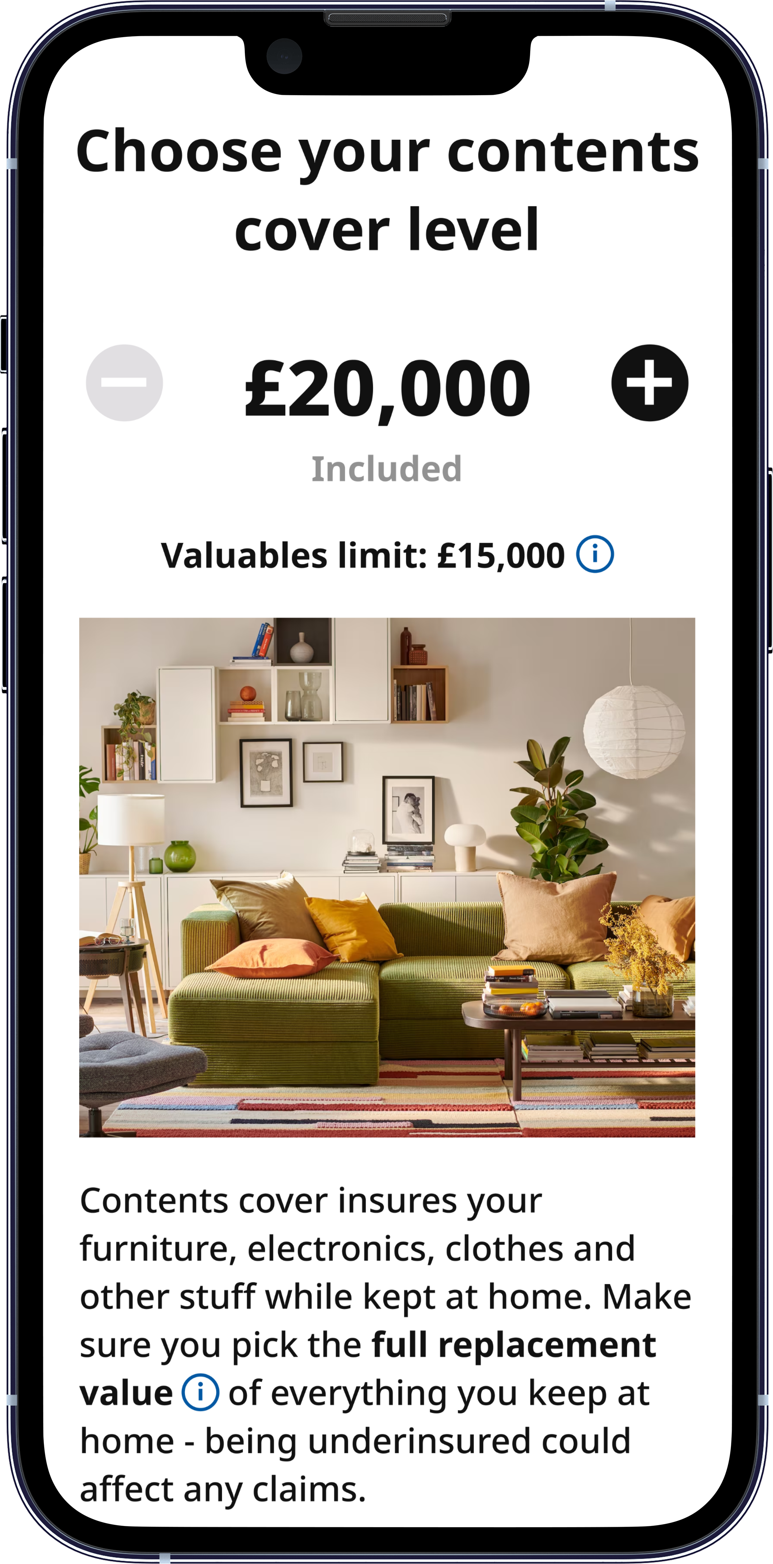
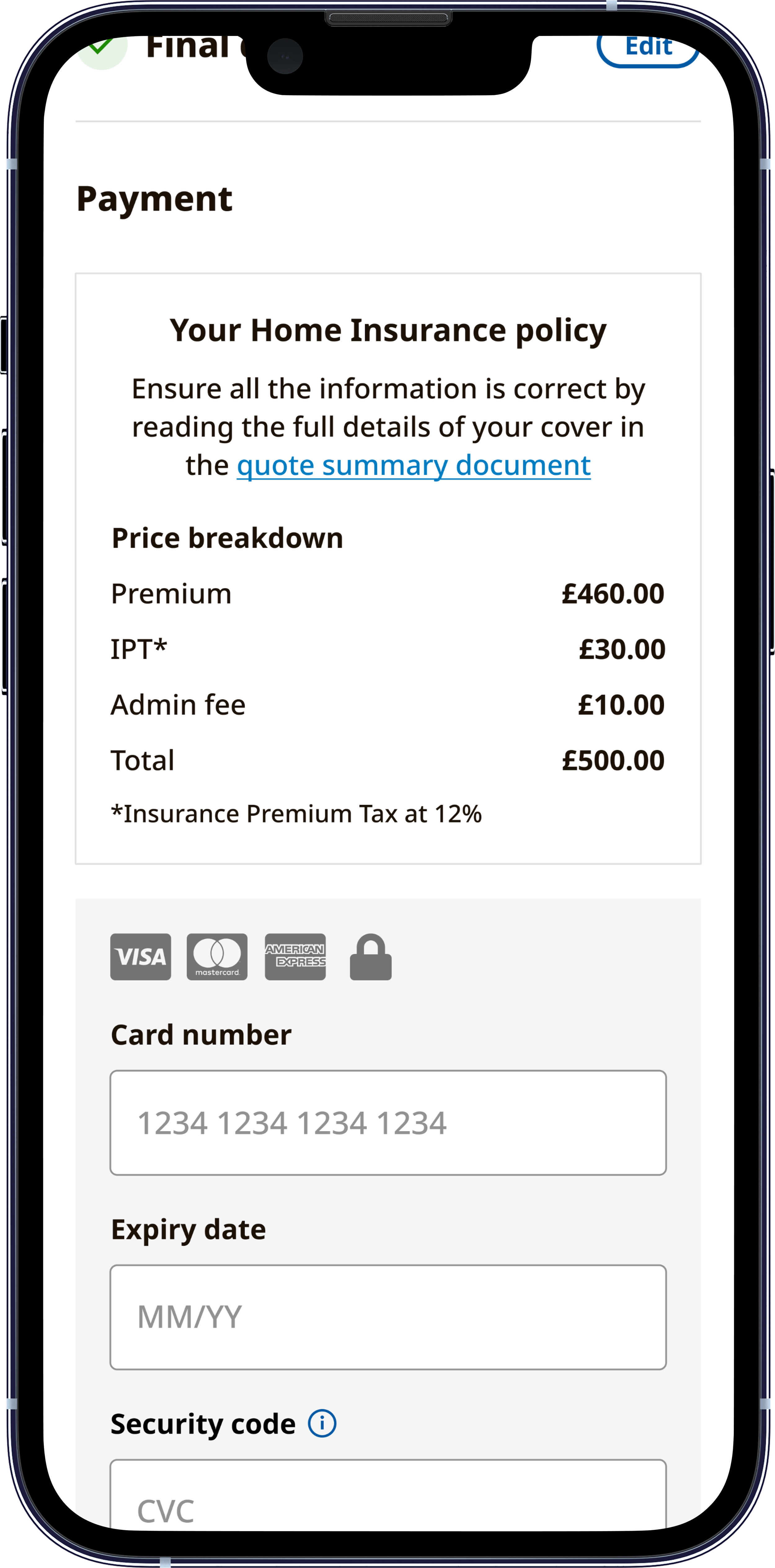
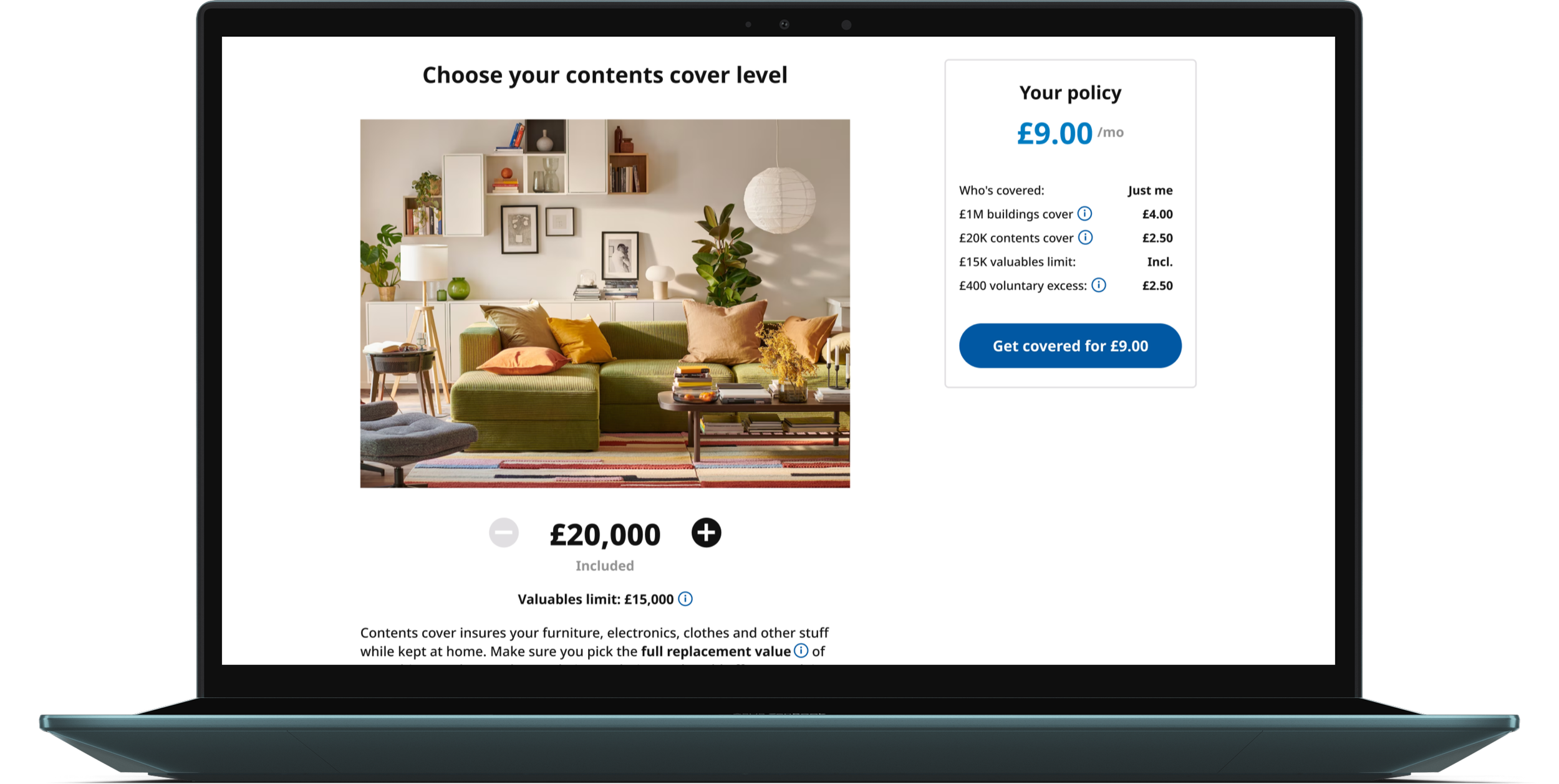
Feature 2: IKEA UI Library — From Concept to Build-Ready in 3.5 Weeks
Rebuilding from scratch would have taken months and introduced unnecessary risk. Instead, we re-skinned Urban Jungle's existing Tailwind component library, replacing colour, typography, iconography, and photography with IKEA's design language while retaining the underlying logic, interaction patterns, and functionality that engineering had already validated.
We used Figma Make to rapidly generate and iterate on IKEA-branded UI concepts, producing testable prototypes quickly enough to share with IKEA UK's design and compliance teams in early review cycles.
Rather than presenting static screens, we could show how the brand moved and behaved across interactions, which gave stakeholders the confidence to sign off on UX decisions they might otherwise have questioned.
Example of a Figma Make iteration based on compliance feedback from the IKEA compliance team on our online claims submission journey
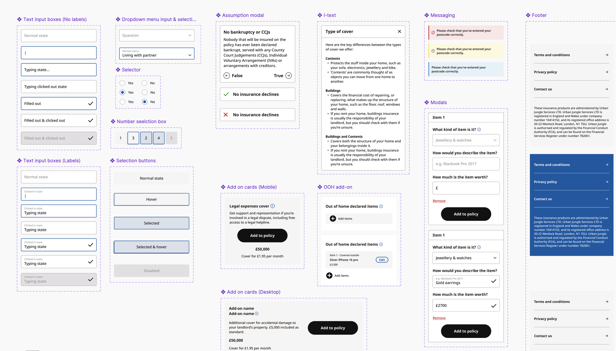
Some of the component sets in our IKEA UI library
Delivered
120+ components
across Figma, Tailwind, and frontend engineering services
90+ screens
across 5 purchase journeys for 3 products (direct & PCW) plus account management
1.5-2 months
of engineering time saved versus a rebuild from scratch
3.5 weeks
from kick-off to build-ready assets
Stakeholder Management + What Didn't Work
The Sign-Off Process
Design went through two parallel review tracks simultaneously: internal review with our product, compliance, and engineering teams to surface build constraints early, followed by one to two rounds of external feedback from IKEA UK's design and compliance teams on brand usage and UX.
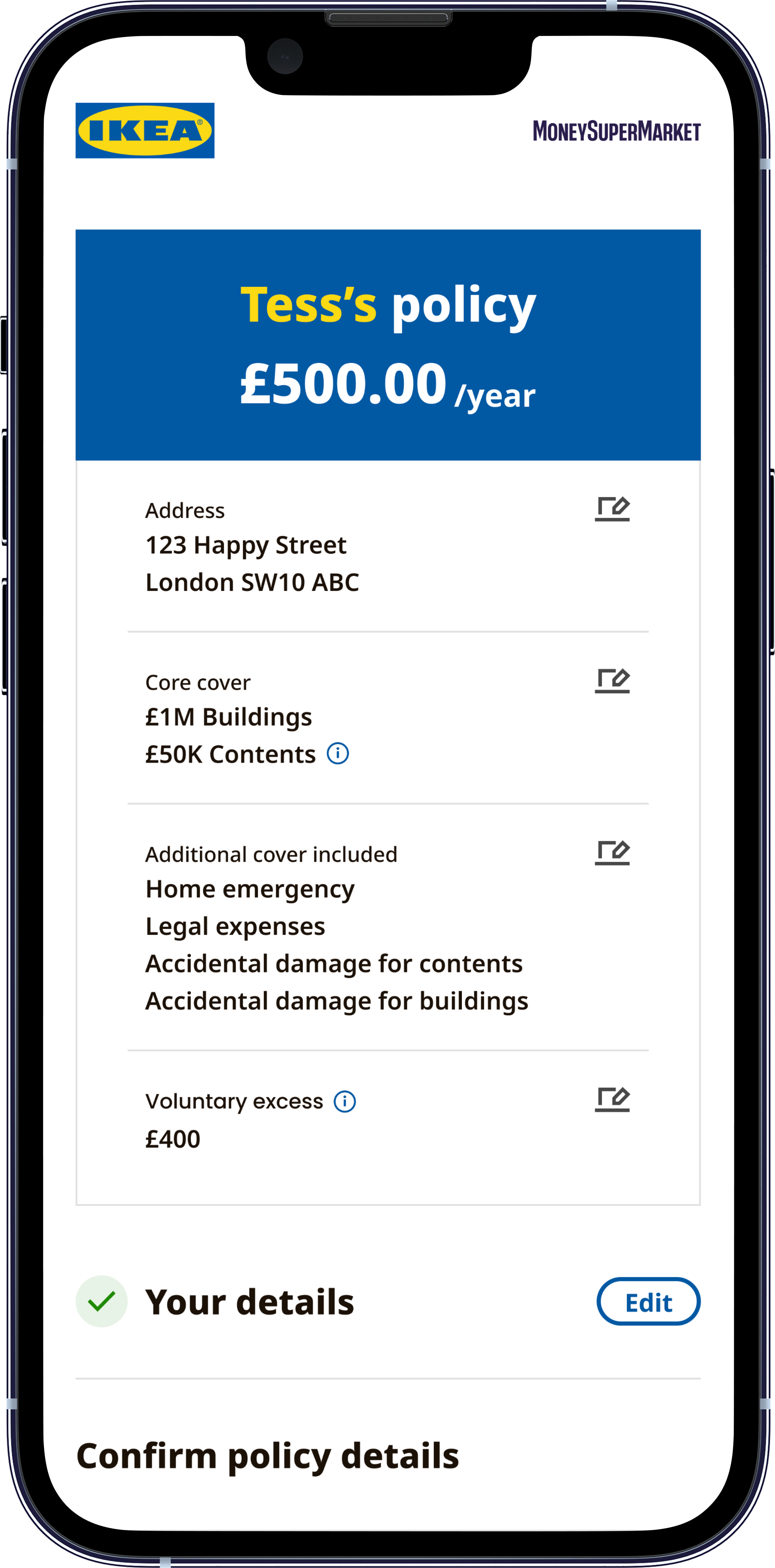
The most complex negotiation was around co-branding.
Ingka (the entity that owns the IKEA trademark) had specific compliance concerns about how customers were informed that the product was administered by Urban Jungle. The question wasn't just visual; it had regulatory weight.
We produced numerous mockups exploring different co-branding approaches for both PCW results pages and the direct journey. The final solution balanced two different contexts: a more prominent shared logo when a customer lands on the purchase journey (where trust and transparency matter most), and a more IKEA-forward treatment on PCW results pages, where logo size constraints limit what's possible.

Some of the logo options explored

Getting the compliance team comfortable with this required showing them the full customer experience in context, not just isolated screens, which is where Figma Make and Claude Code prototypes became essential.
The Single-Page PCW Checkout: A Failed A/B Test and a Pivot
The original IKEA PCW checkout was designed as a single-page experience – collapsing a traditional multi-page funnel into one continuous flow. This was based on a central hypothesis: that reducing navigation friction would increase conversion rate by approximately 10% and lift GWP (Gross Written Premium) meaningfully.
We ran the A/B test on Urban Jungle's existing home insurance product before committing the pattern to the IKEA build.
The result was a statistically significant 12% reduction in CVR (conversion) for the variant.
Post-test analysis identified several contributing factors. Around 10% of customers switch their payment frequency mid-journey – a behaviour the single-page design had removed. Some PCWs also have a known behaviour where toggling between options on the results page causes incorrect payment frequency on click-out, which the new design didn't account for. Hotjar recordings suggested unexpected behaviour around excess selection, and some standard PCW tracking events appeared not to be firing correctly on the variant, making the data harder to interrogate fully.
The honest conclusion was that a design that reduced steps for us also removed flexibility that customers were actively using.
We rolled back the control on our own product and scrapped the single-page checkout for IKEA entirely, reverting to our existing multi-page journey. While this was the right decision, it meant redesigning a significant portion of the PCW experience mid-project and resetting expectations with IKEA's team. Managing that conversation clearly and quickly, with a data-backed explanation rather than a hedged one, was as much a design challenge as the wireframes.
IKEA-branded designs for the single-page PCW variant journey that proved worse for CVR in our A/B test
Overall Business Impact
The product hasn't launched yet. The figures below represent targets set against a clear commercial thesis.
Metric
Sales per month within year one
On-risk customers within year one
PCW products at launch
PCW products post full integration
Direct products at launch
Target
500
27,000
6 (2 products × 2 PCWs × 3 brand tiers: Bronze, Silver, Gold)
12 (all four major PCWs)
3
Next up
Pricing and design A/B tests against Urban Jungle's own branded products on PCW to directly measure how brand influences conversion rate, average transaction value, add-on uptake, and broader customer behaviour. The IKEA product will give us a genuine controlled comparison for the first time
Reflection
The biggest thing I took from this project is how much AI prototyping tools accelerate alignment with non-technical stakeholders.
Sharing a working Figma Make prototype with IKEA's compliance team, something they could interact with rather than interpret, changed the nature of the feedback we got. They could trust the UX judgements more quickly because they could feel the experience rather than imagine it.
I also valued the creative challenge of taking our own UX principles (clear information hierarchy, reducing cognitive load, the simplest path to action) and expressing them through a completely different visual language. Working with IKEA's photography and brand identity pushed me to think about the flexibility of our own component library in ways I wouldn't have encountered building for Urban Jungle alone.
The A/B test failure on the single-page checkout was a useful reminder that a hypothesis backed by good logic still needs to be tested. Shipping a design you believe in and being willing to reverse it cleanly when the data says otherwise is a better outcome than never testing the assumption at all.